SCOPE:
BRAND IDENTITY DESIGN
CLIENT
WABI SABI
YEAR:
2024
ROLE:
INDEPENDENT DESIGNER
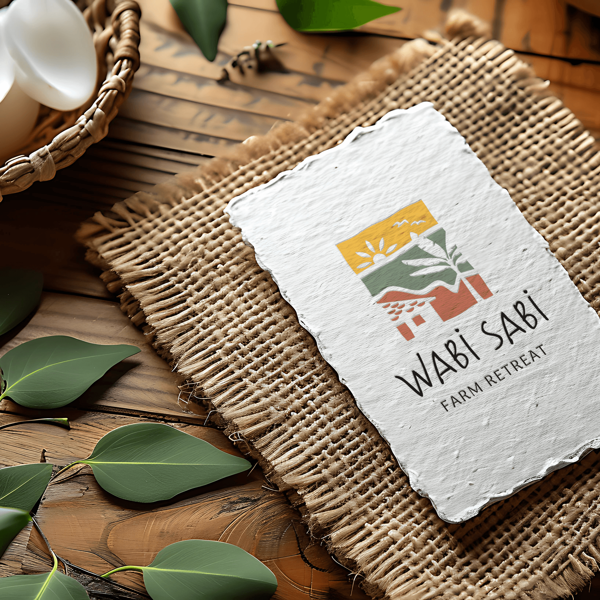
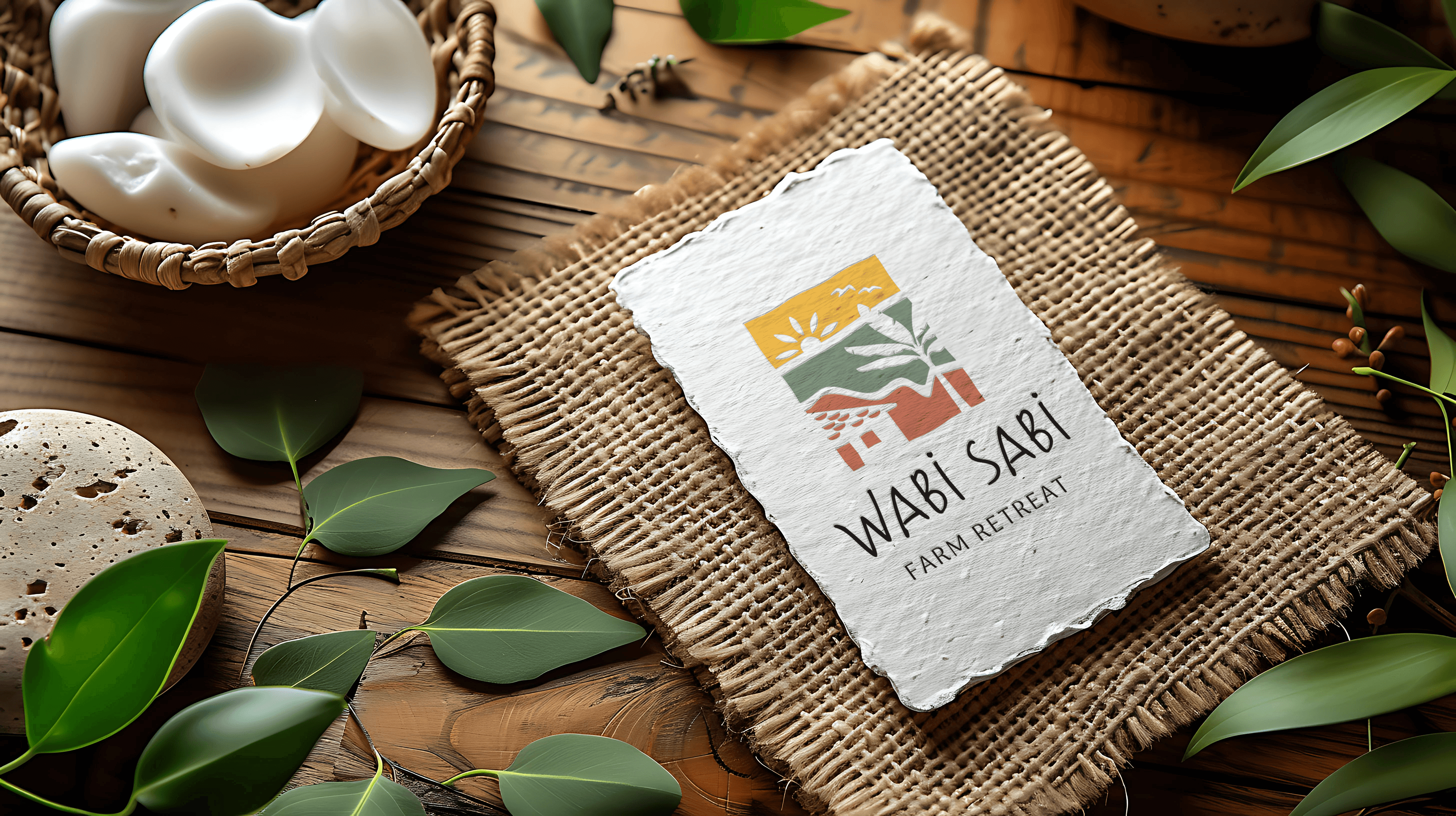
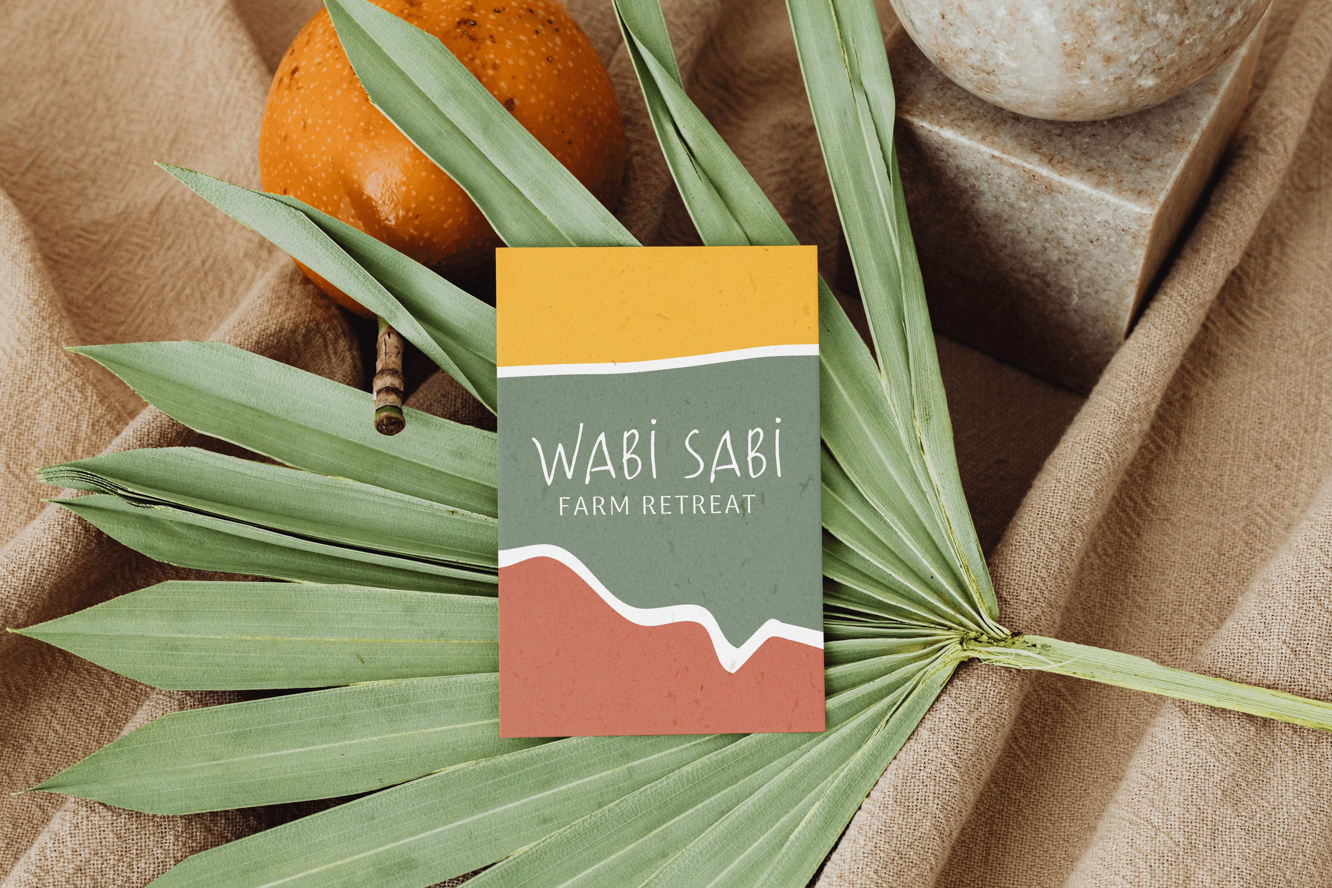
Wabi Sabi
project context.
see it live
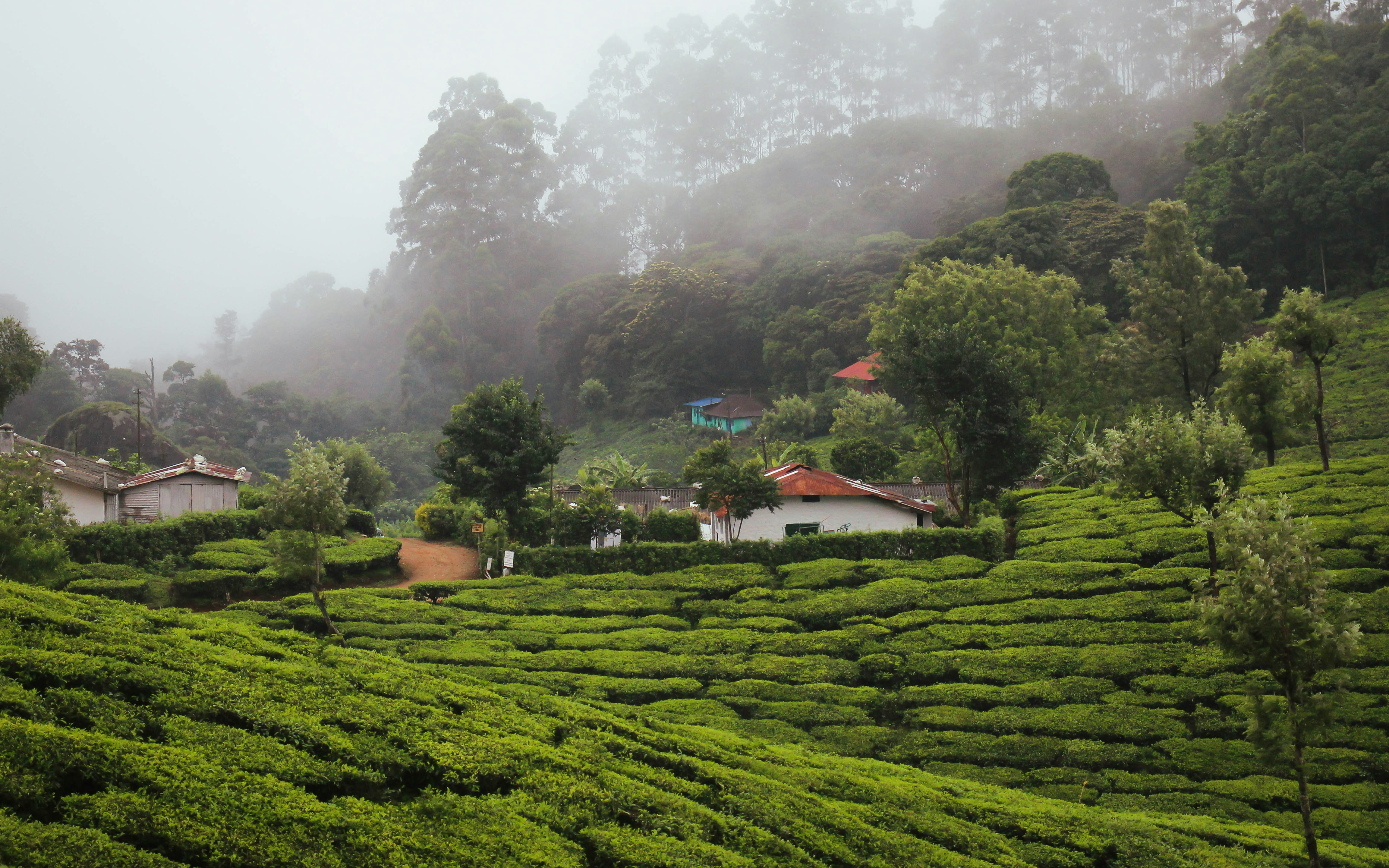
Wabi Sabi is a rural farm retreat nestled in the plains of Andhra Pradesh, India, surrounded by gently rolling hills. Founded on the principles of slow living, the retreat encourages guests to disconnect from the pace of city life and reconnect with nature, and with themselves, through simplicity, stillness, and tradition. Its philosophy draws from the three stages of life: childhood, adulthood, and old age, encouraging visitors to embrace presence at every phase. The retreat offers a humble yet soul-nourishing experience, including traditional home-cooked Telugu meals, reminiscent of what a mother or grandmother might lovingly prepare.


design objective.
The goal was to create a brand identity that felt approachable, rustic, and rooted in warmth, and one that spoke directly to a middle-class Indian audience seeking meaningful family time in nature, without the frills or alienation of luxury. The visual identity needed to be vibrant yet grounded, conveying the emotional depth and natural beauty of the retreat.
design outcome.
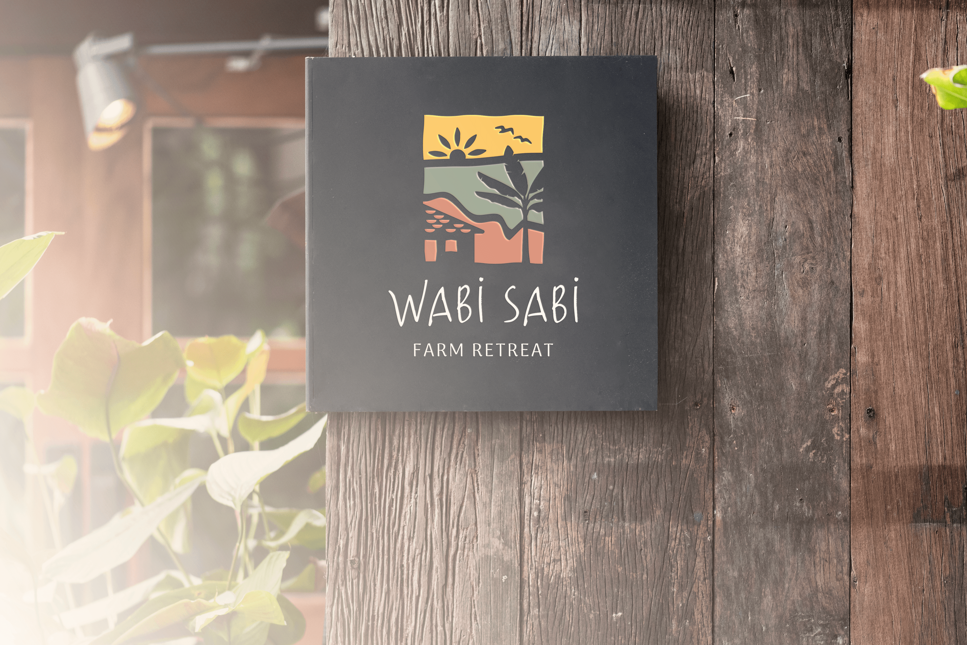
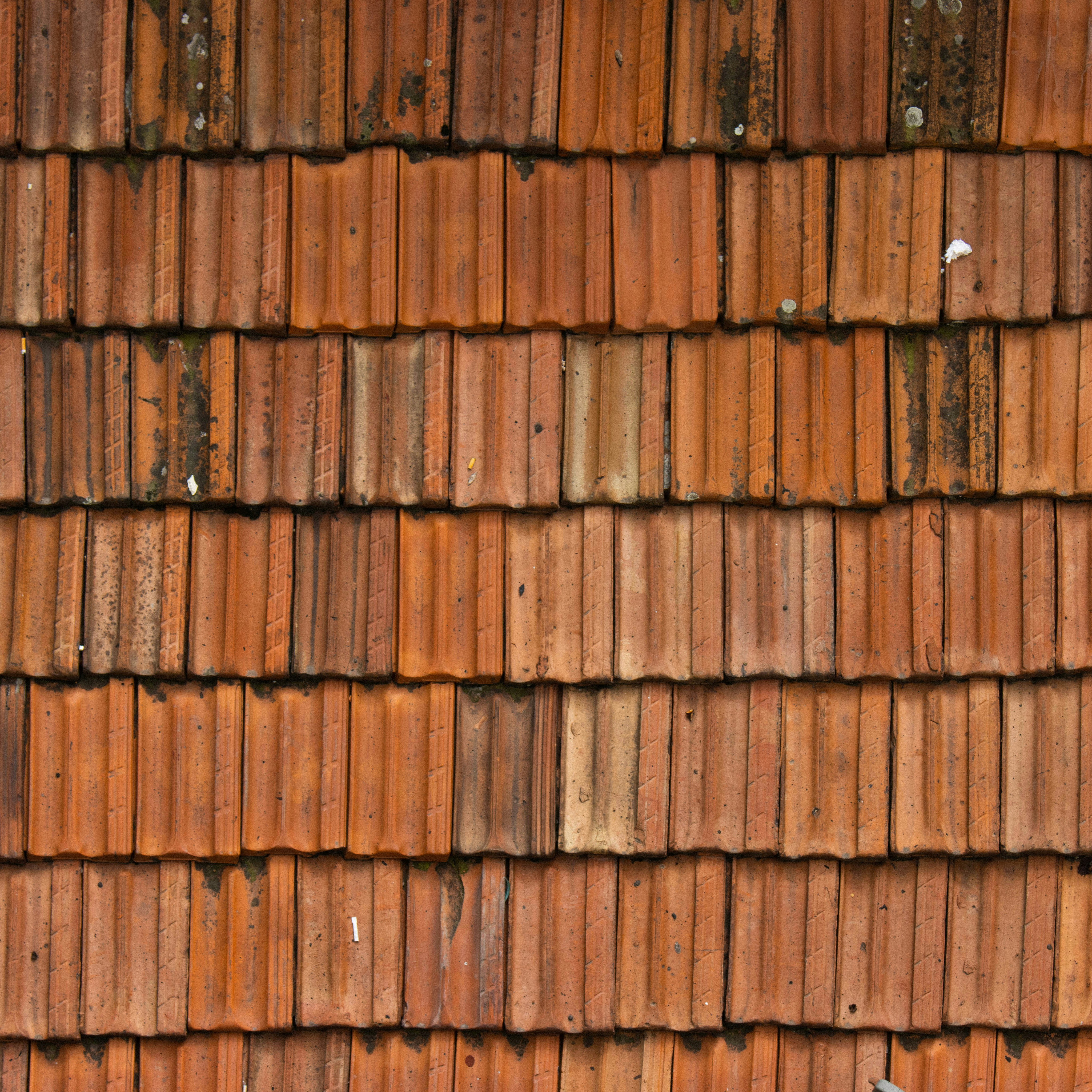
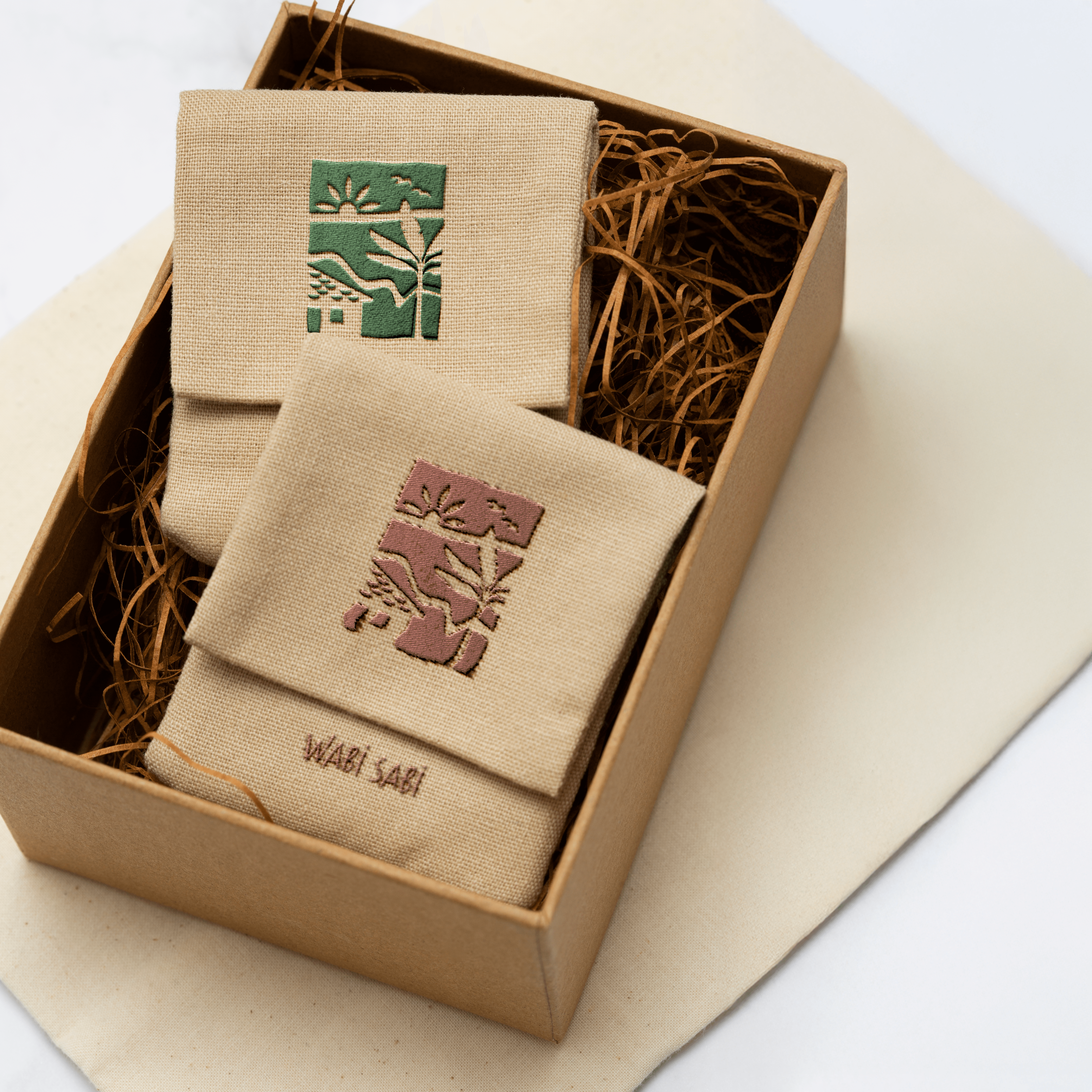
The final logo takes on a hand-drawn, illustrative style, using a warm, earthy color palette and playful typography to evoke comfort, familiarity, and connection. Structured in three horizontal layers, each represents a stage of life. The logo features rolling hills at the base to reflect the retreat’s physical setting, a rustic tiled-roof home at the center to reference the iconic on-site architecture, and a sun, tree, and bird above, symbolizing nature, freedom, and rejuvenation. This layered composition embodies the retreat’s deeper narrative while remaining visually accessible. The identity has been implemented across signage, digital platforms, and physical touchpoints, bringing cohesion and emotional resonance to the retreat experience.