SCOPE:
ILLUSTRATION & T-SHIRT DESIGN
CLIENT:
THE STROKE FOUNDATION
YEAR:
2024
ROLE:
INDEPENDENT DESIGNER

The Stroke Foundation
project context.
see it live
The Stroke Foundation is a non-profit organization that supports stroke survivors and their caregivers, raising awareness about prevention, recovery, and long-term care, and providing support resources. As part of a fundraising and awareness campaign, the organization wanted to create a line of T-shirts that could reach a wider, younger audience, without feeling like traditional cause-based merch. Instead of the usual “event-day” tees, the aim was to create fun, emotionally resonant apparel that people would actually want to wear, helping spark conversation and reduce stigma around stroke recovery.
design objective.
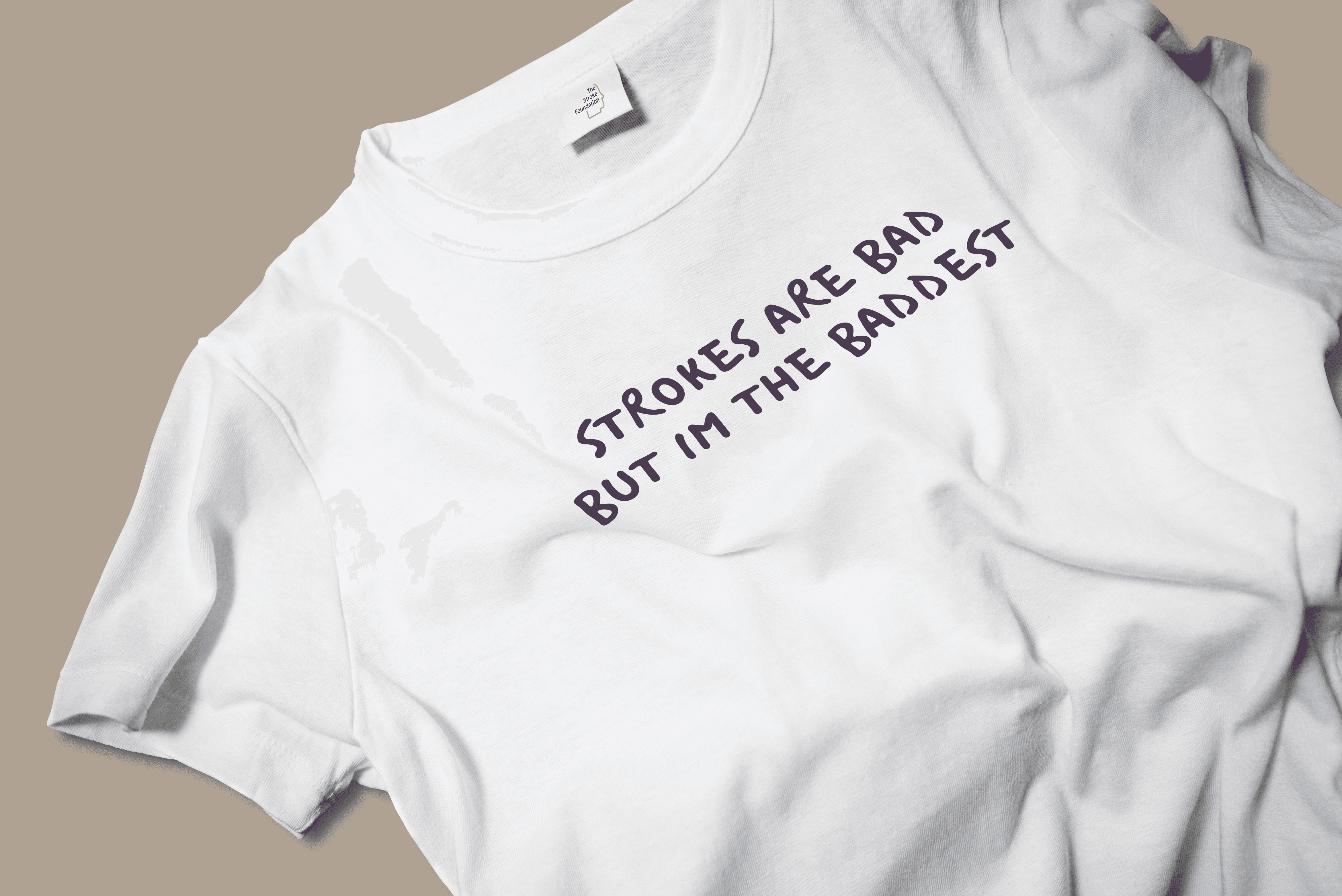
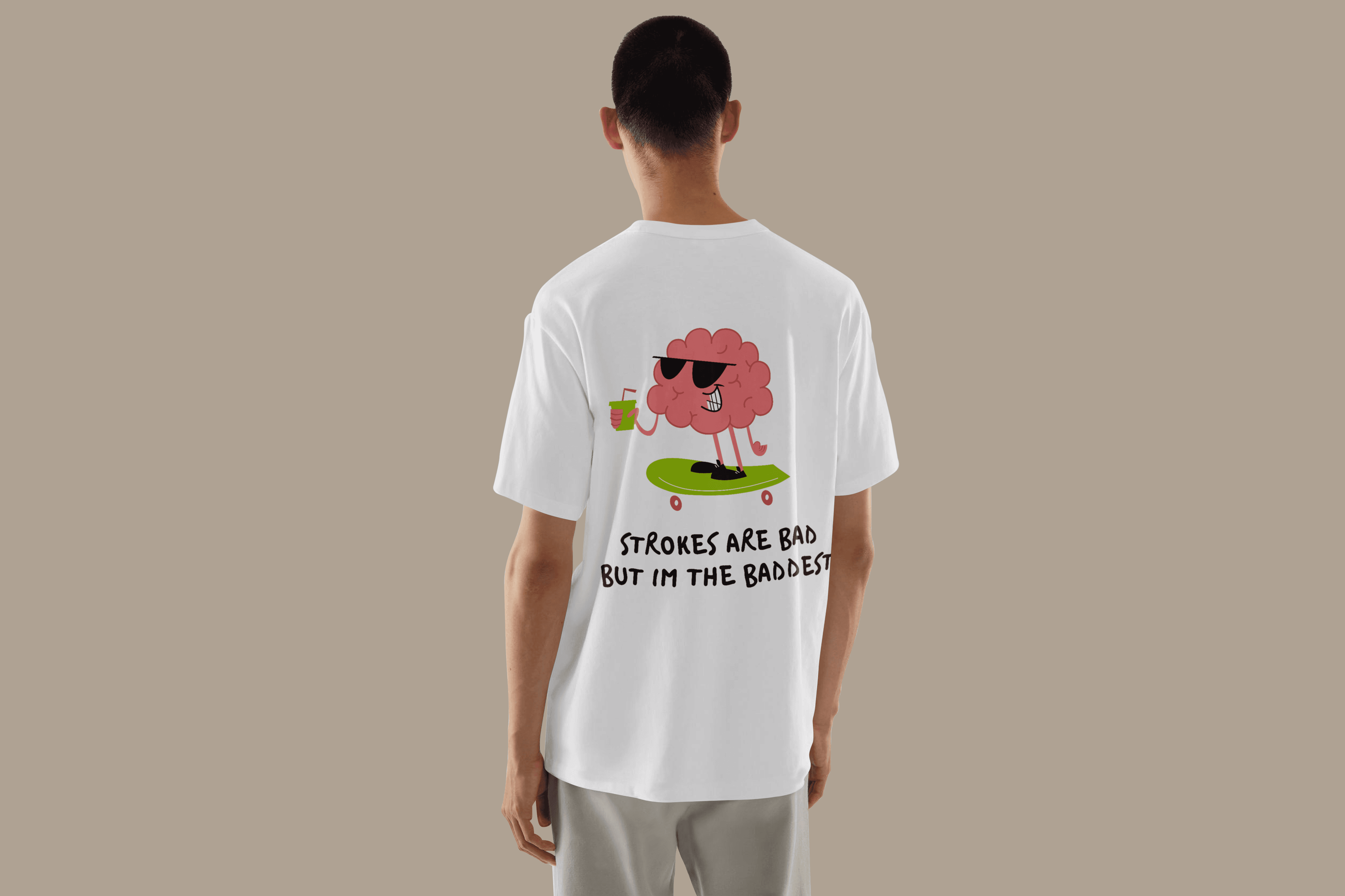
The goal was to craft a line of illustrations and phrases that felt universally relatable, emotionally light, and truly wearable, while still honoring the serious nature of the cause. To avoid assumptions around gender, race, or age, the decision was made to steer away from human characters and instead introduce a singular expressive mascot: a pink, plucky cartoon brain. This character would become the face of the campaign, funny, endearing, and inclusive, and able to convey empathy, empowerment, and education with charm.
design outcome.
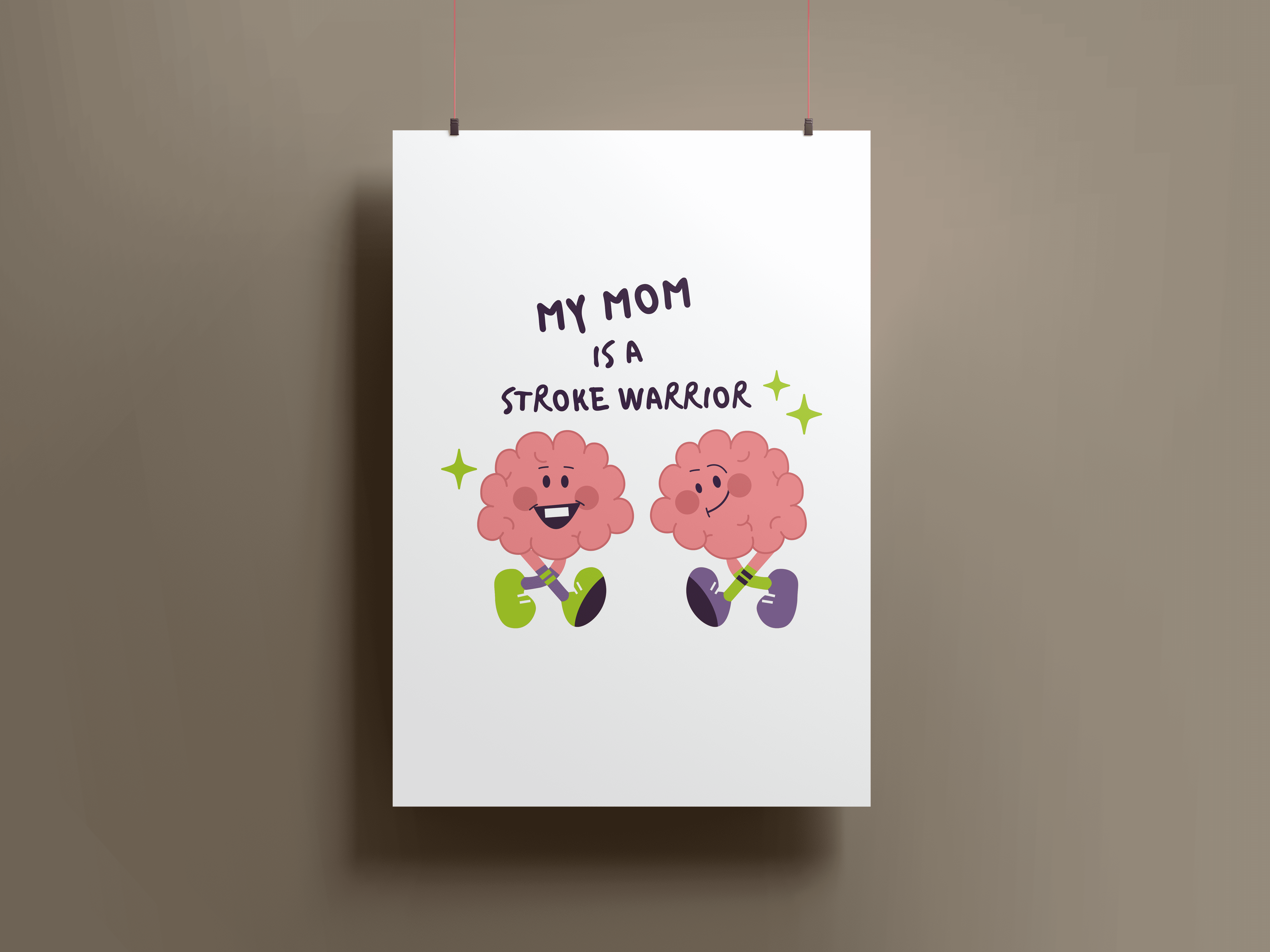
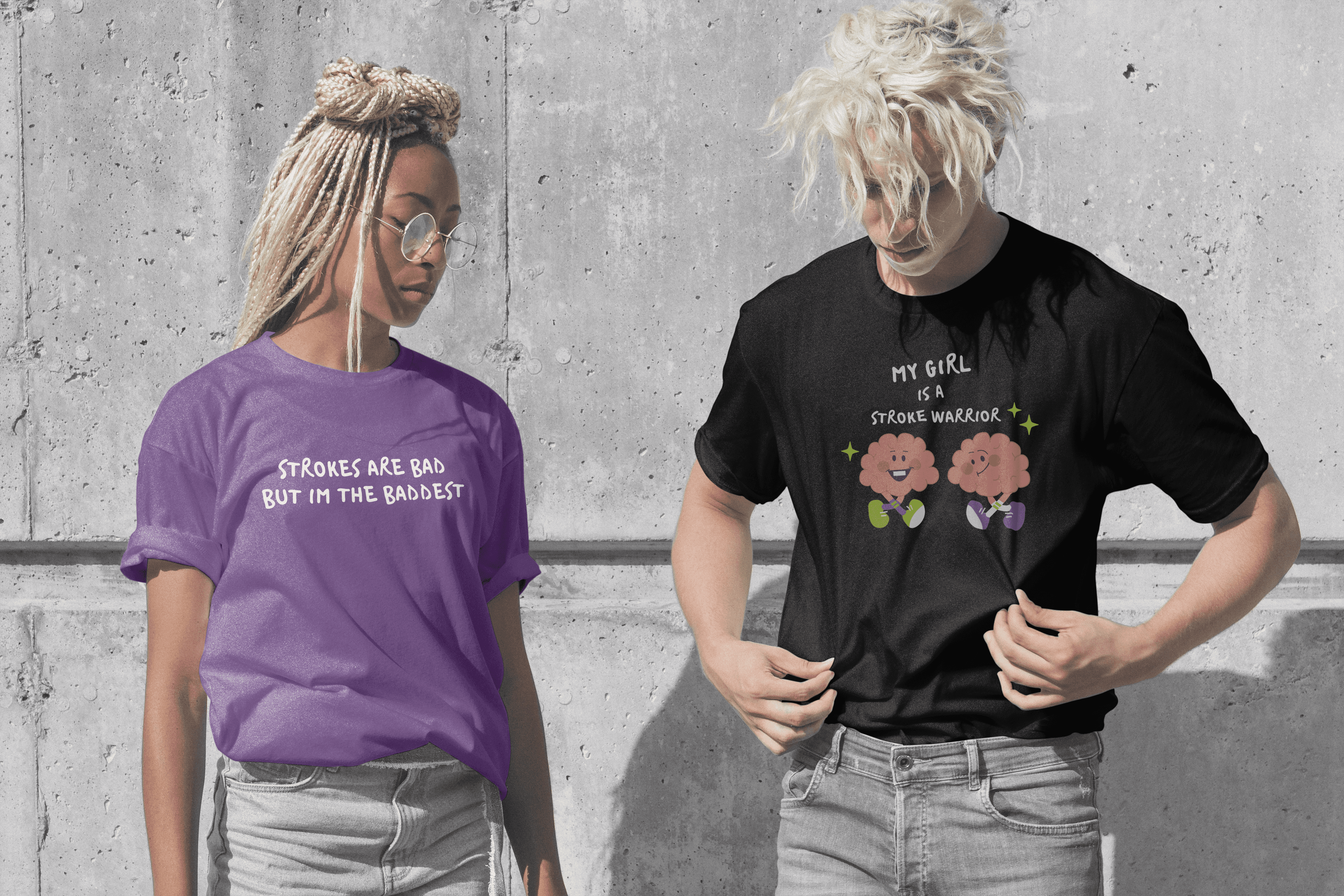
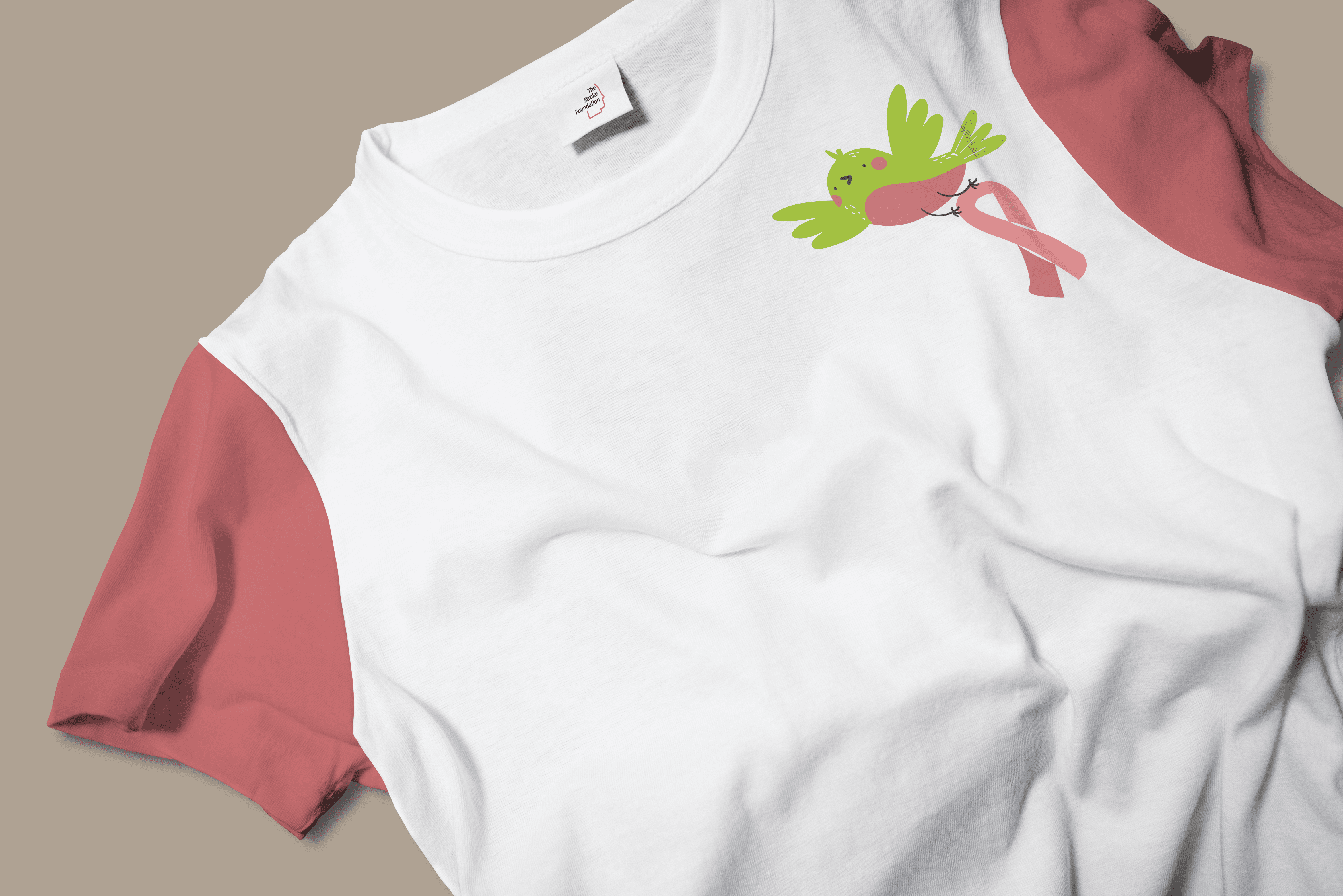
The resulting design system centered around a custom-illustrated brain character that appeared across multiple T-shirt designs, stickers, and awareness graphics. Each version of the character was tailored to a specific message or moment: skateboarding confidently with a drink in hand (“Strokes are bad but I’m the baddest”), dancing joyfully beside loved ones (“My mom/dad/bestie is a stroke warrior”), or peacefully resting for World Stroke Day awareness. The playful tone was further supported by a custom hand-drawn typeface, a bright but soft palette, and short punchy phrases that balanced humor with heart.
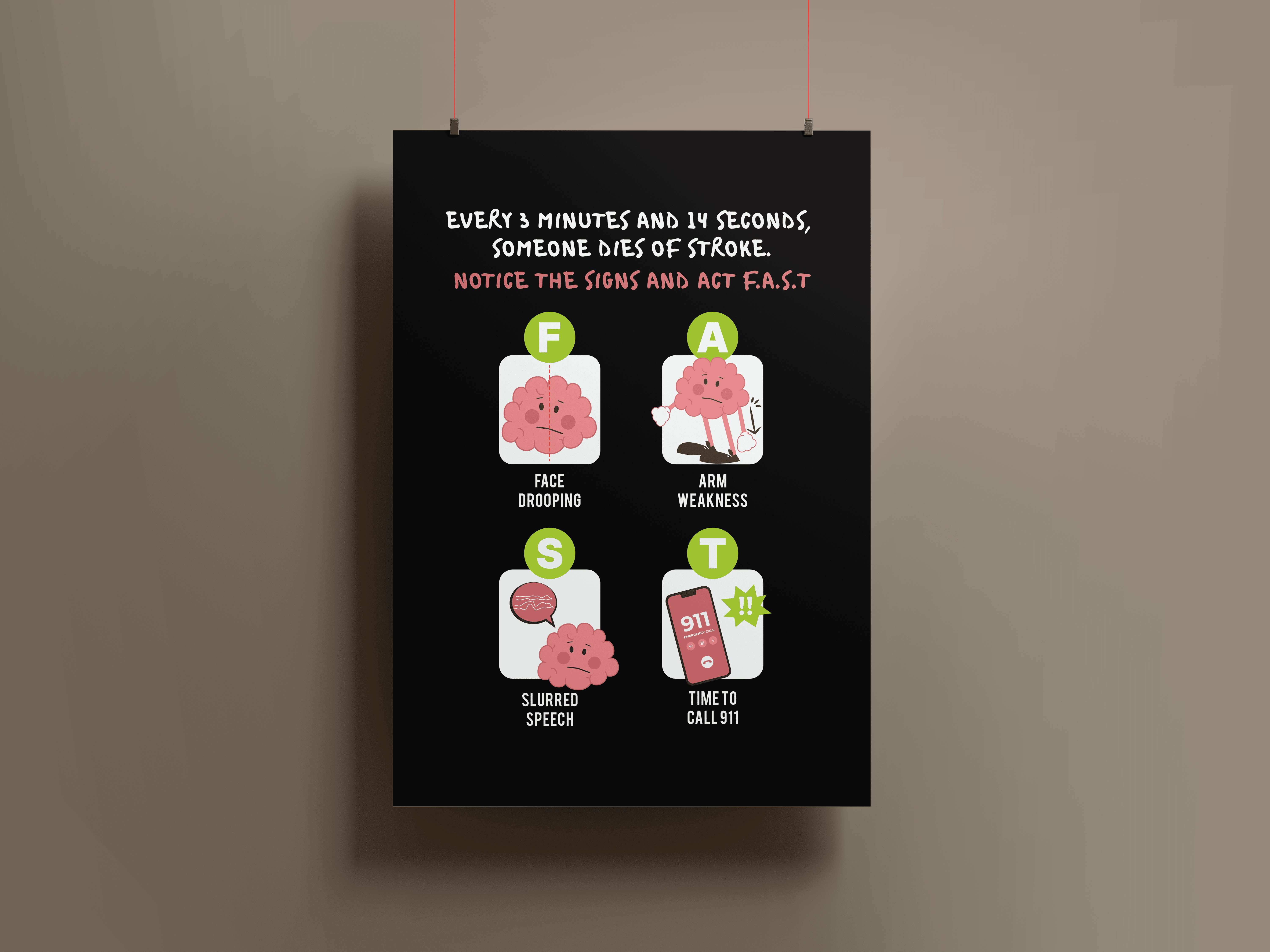
To complement the lifestyle-oriented shirts, an educational T-shirt was also designed specifically for World Stroke Day (October 19th). This included an illustrated FAST acronym — Face Drooping, Arm Weakness, Slurred Speech, Time to Call — featuring the same brain character acting out each symptom in an engaging, memorable way. This design served as a powerful conversation starter and quick visual guide that was both informative and approachable.
Together, the illustrations offered a new way to talk about stroke — a way that felt light, wearable, and empowering, while still deeply rooted in advocacy. The campaign helped shift the tone of health communication from medical to human, opening doors to broader engagement and visibility.