SCOPE:
BRANDING & PACKAGING DESIGN
CLIENT:
THE FRAMERS KSHETRA
YEAR:
2019
ROLE:
INDEPENDENT DESIGNER
The Farmer's Kshetra
project context.
Kshetra (Telugu: క్షేత్రం) translates to "field", a name that reflects both place and purpose. The Farmer’s Kshetra is a grassroots Indian NGO committed to improving the lives and livelihoods of India’s farming community. With over 20% of Indian farmers living below the poverty line, the organization’s mission is to address both production and market challenges through education, access to tools, and support systems that promote sustainable, organic practices. One of their long-term goals is to export these farmer-grown products to international markets, particularly the U.S., sharing profits directly with the farmers and thus creating a more equitable agricultural ecosystem.

design objective.
As the NGO prepared for its first product launch, a range of lentils aimed at global consumers, they approached me to create the brand identity and packaging design. The brand needed to feel rooted, honest, and purpose-driven, while also appealing to a young, socially aware audience abroad. The challenge was to translate a deeply Indian agricultural story into a design language that was authentic, globally resonant, and retail-ready.
design outcome.
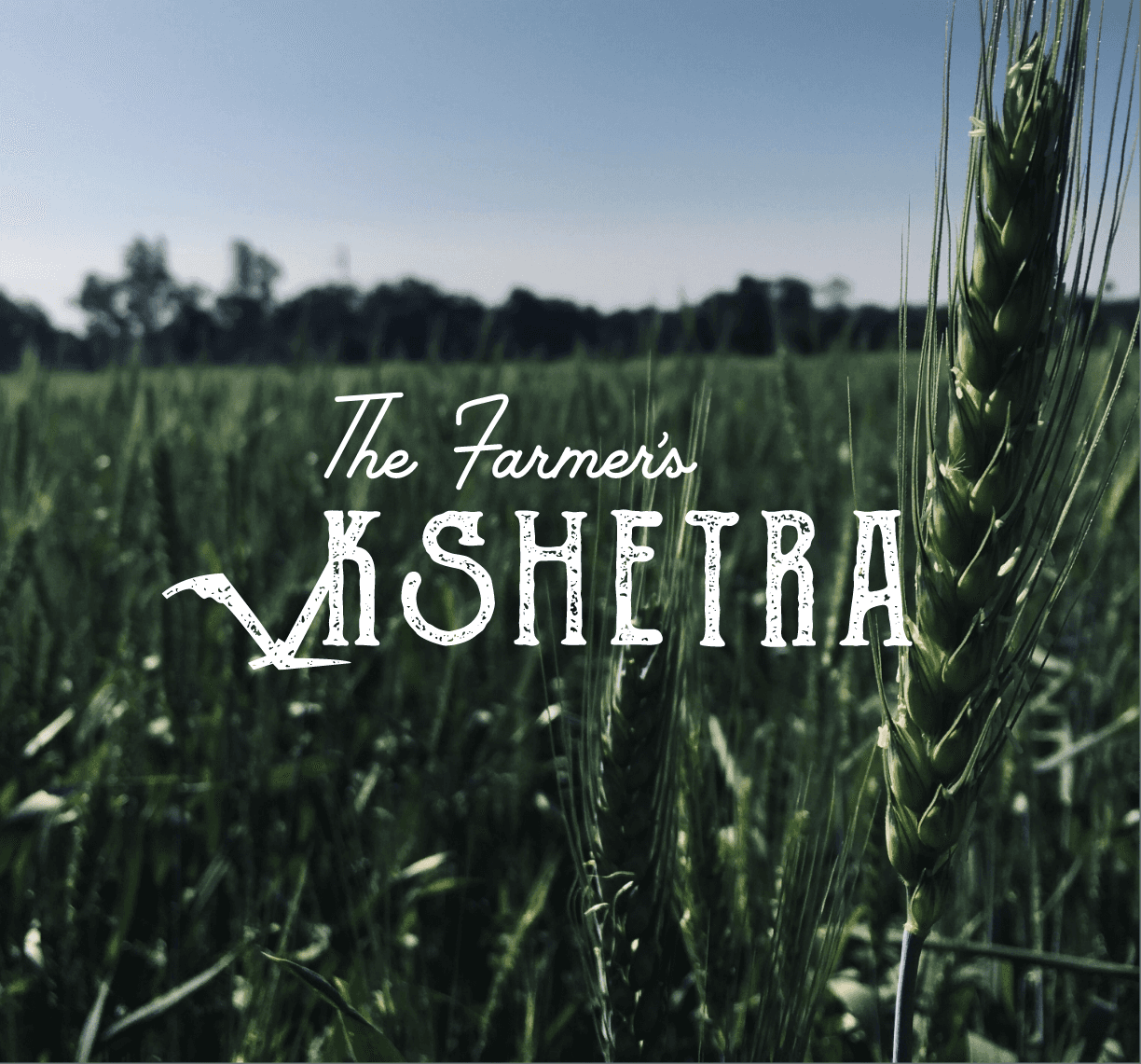
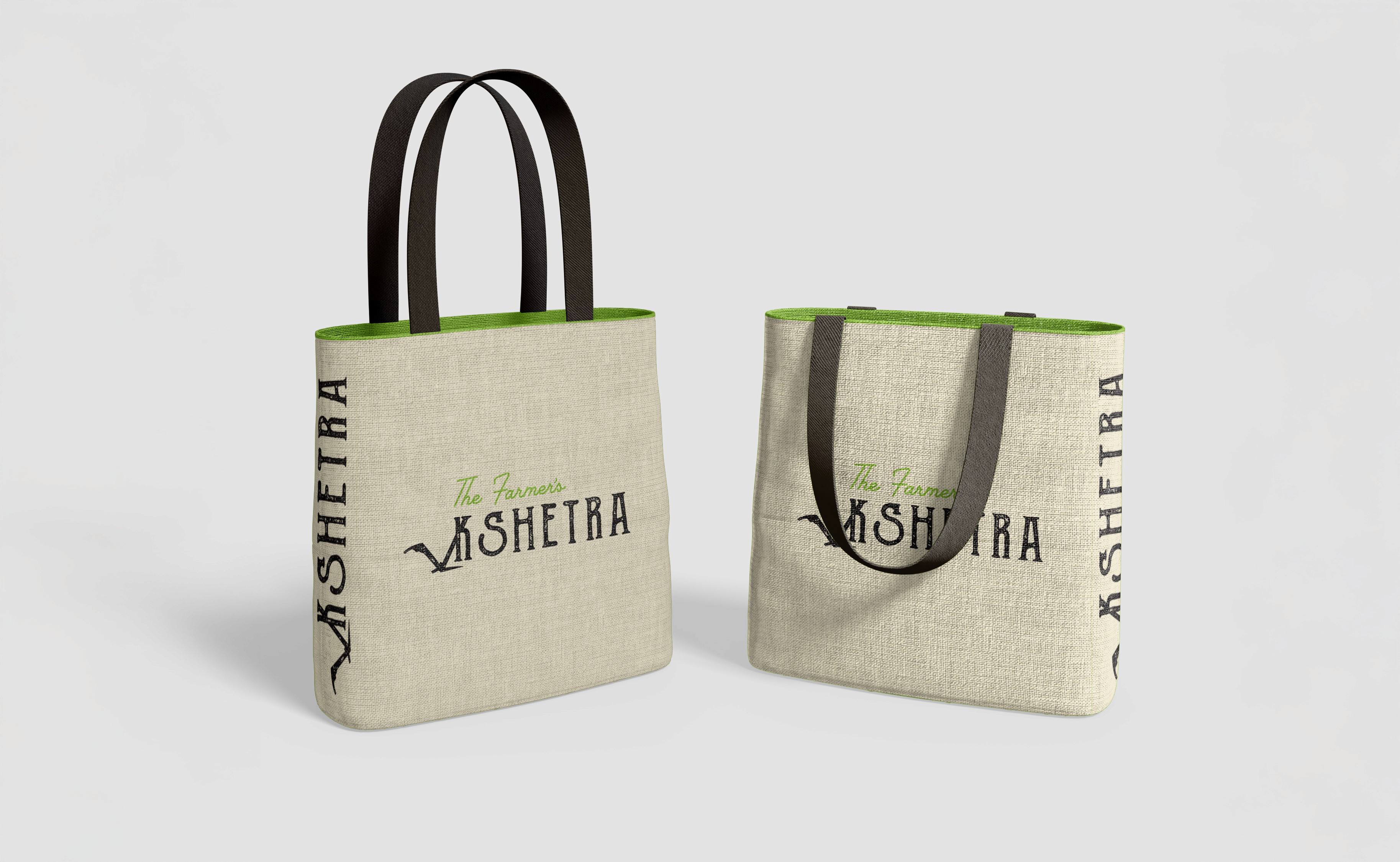
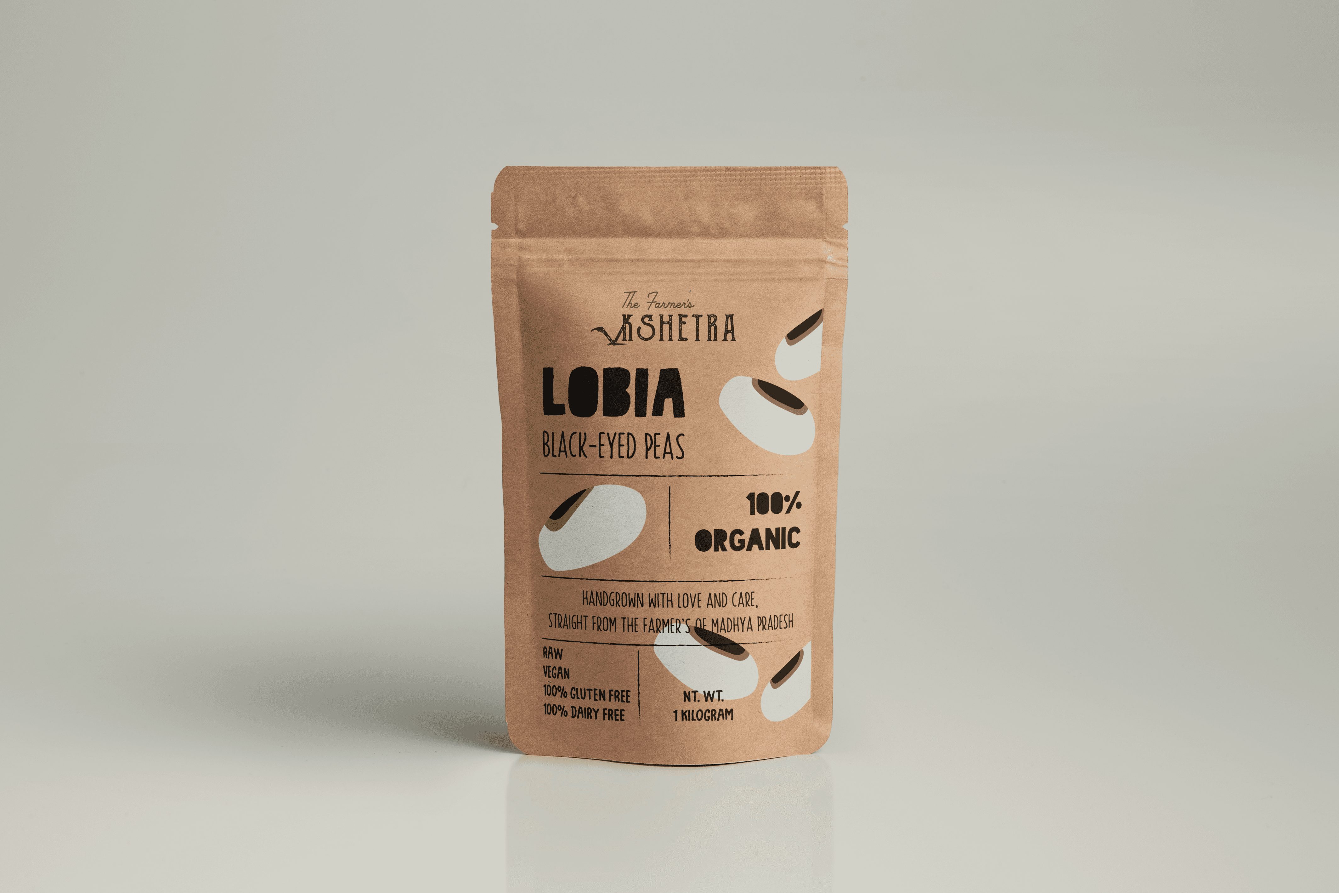
The logo centers around the symbolic use of the Nagali, a traditional Indian plough still used across many regions. This tool, often pulled by oxen, represents the very first step in the farming cycle: the act of preparing the soil, and symbolically, preparing for growth and renewal. The letter ‘K’ in ‘Kshetra’ was modified to resemble this tool, grounding the logo in tradition and narrative. To reflect the tactile, earth-connected nature of farming, a textured serif typeface was chosen for ‘Kshetra’, with slightly rounded edges and a dirt-like grain. For ‘The Farmer’s’, a hand-drawn script added warmth and a sense of personality, reinforcing the human-centered mission of the NGO.
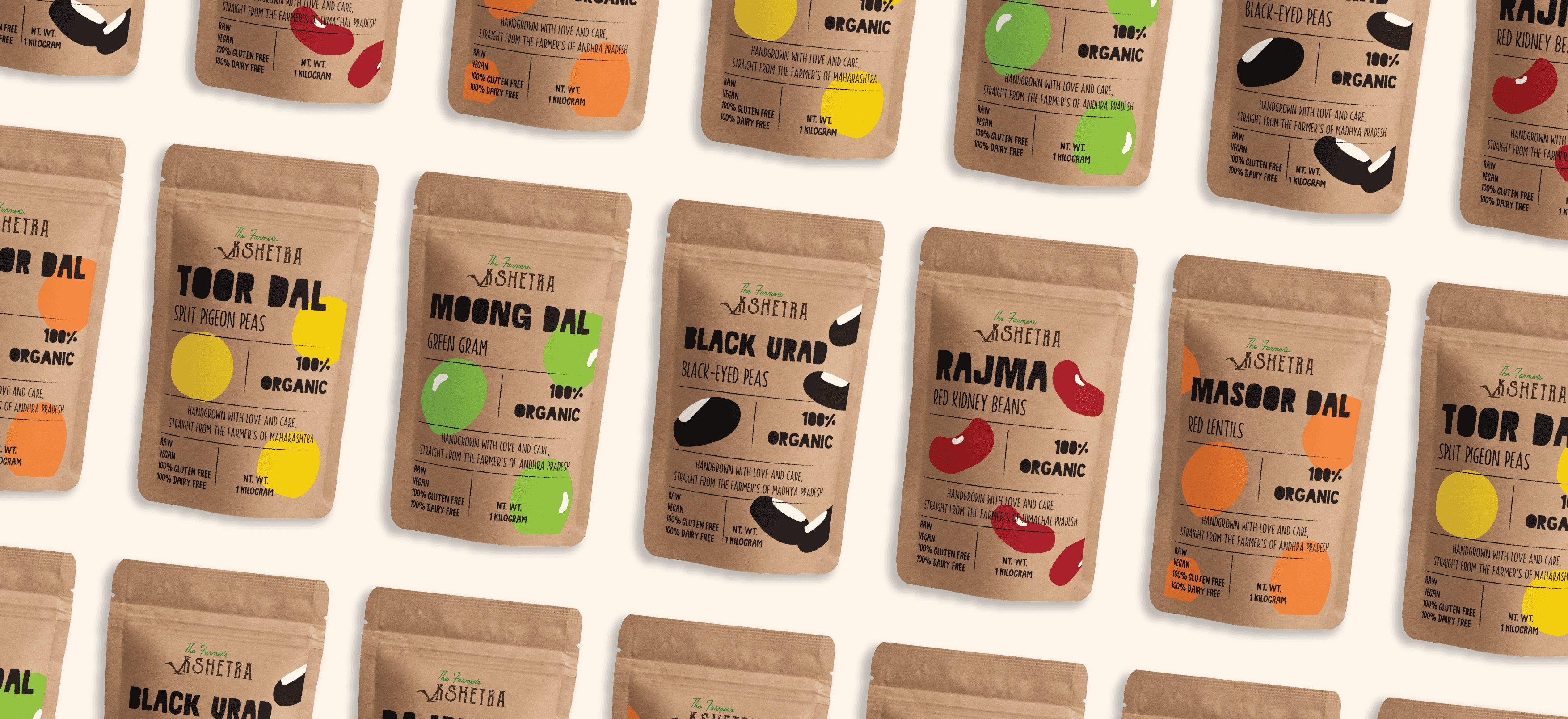
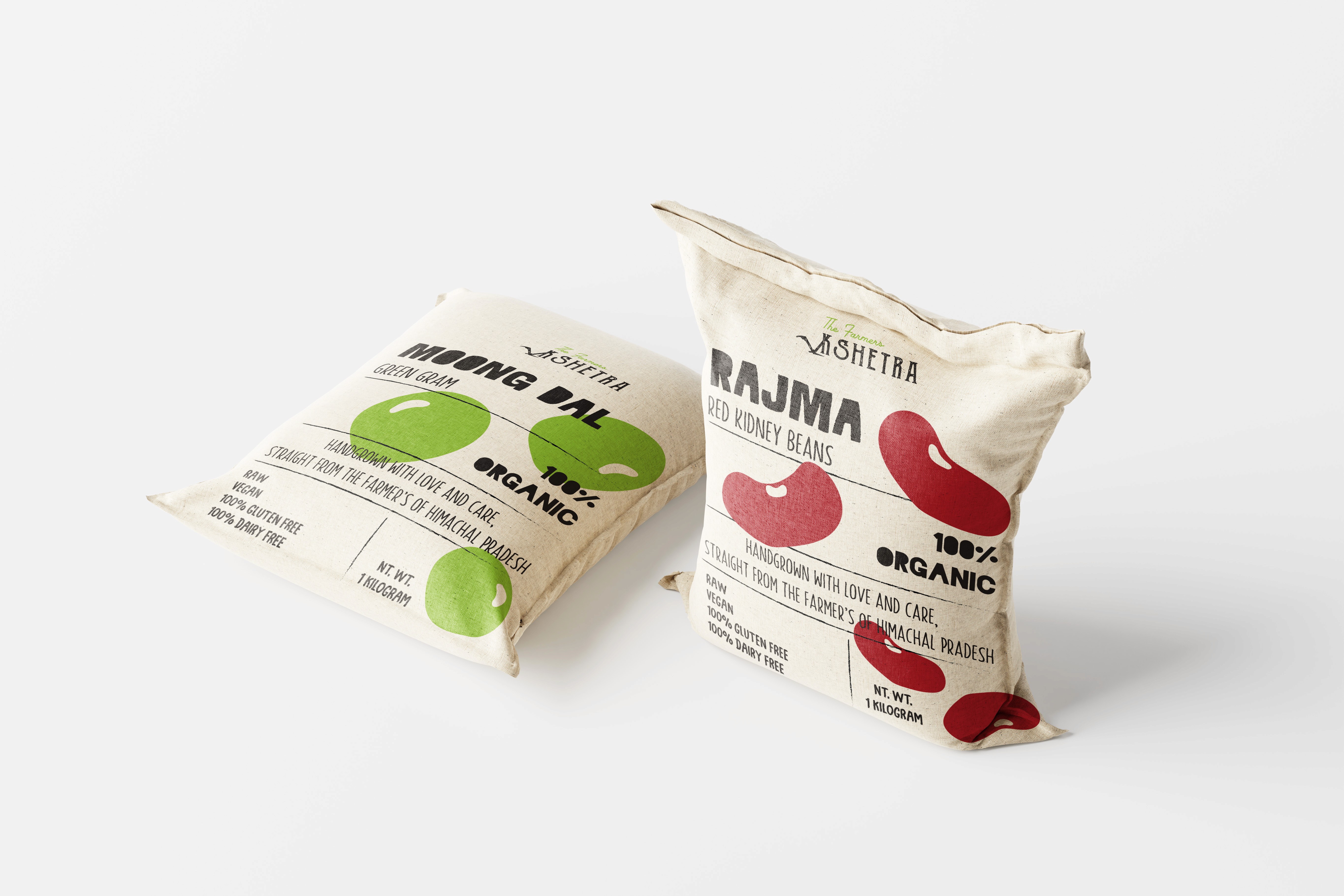
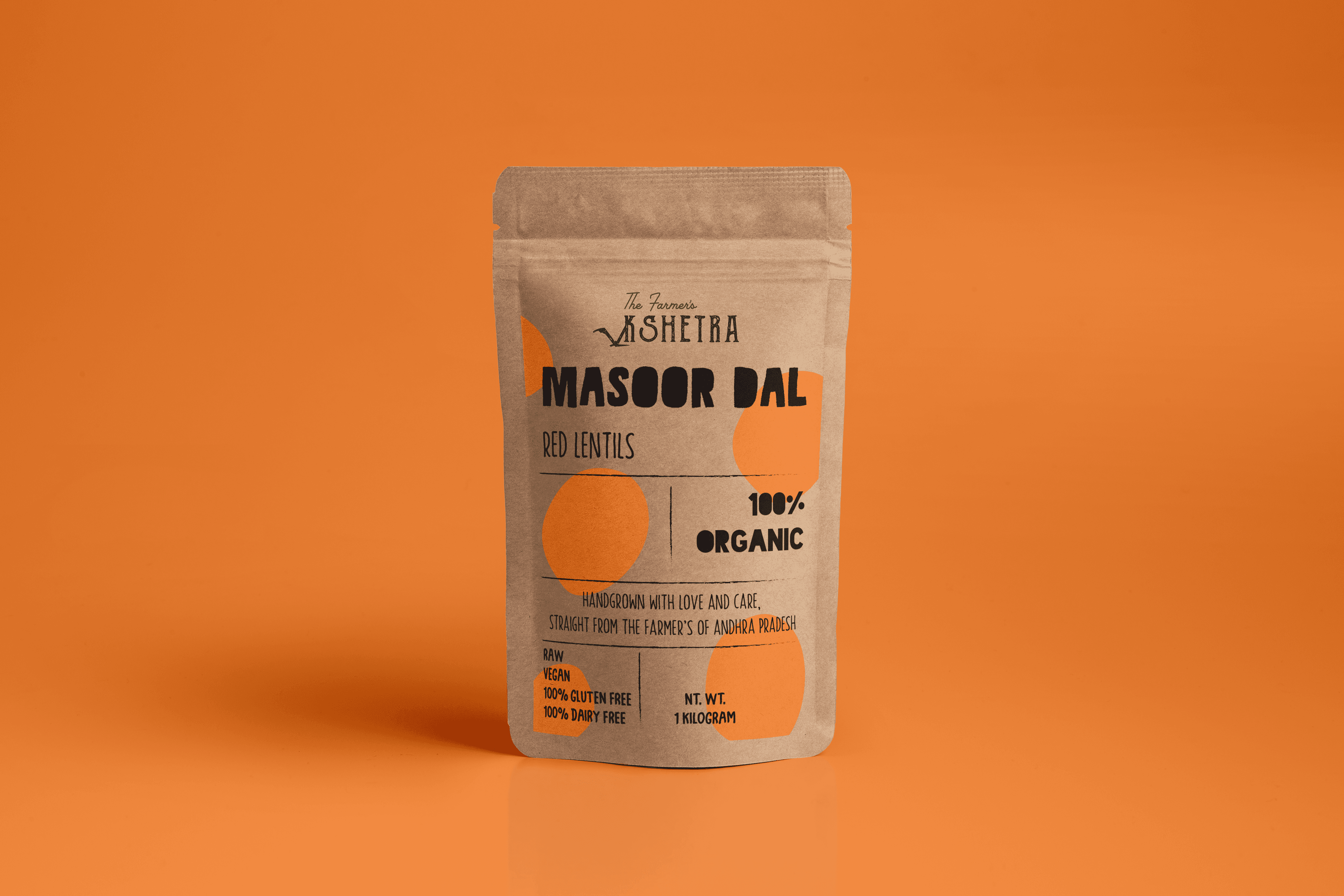
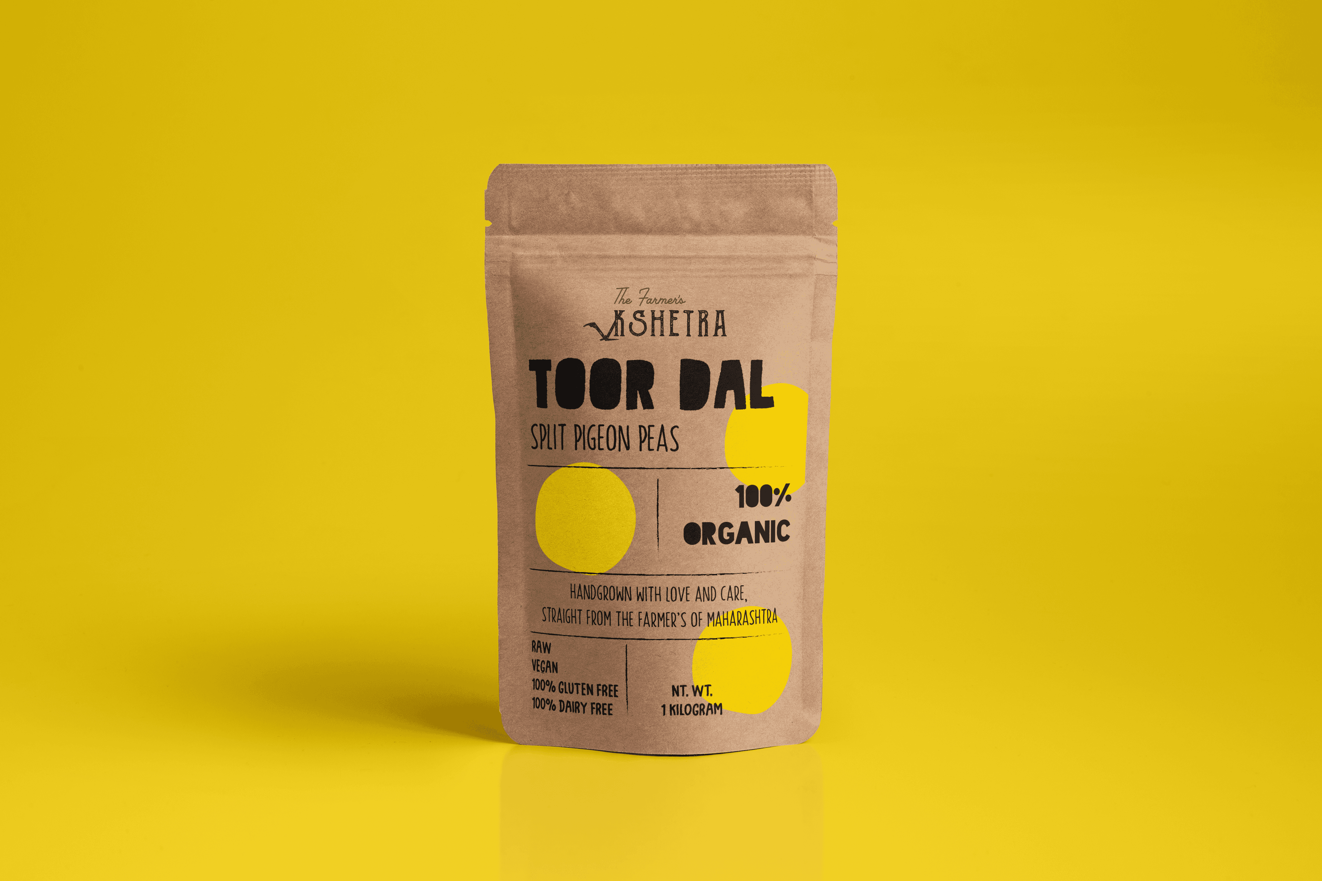
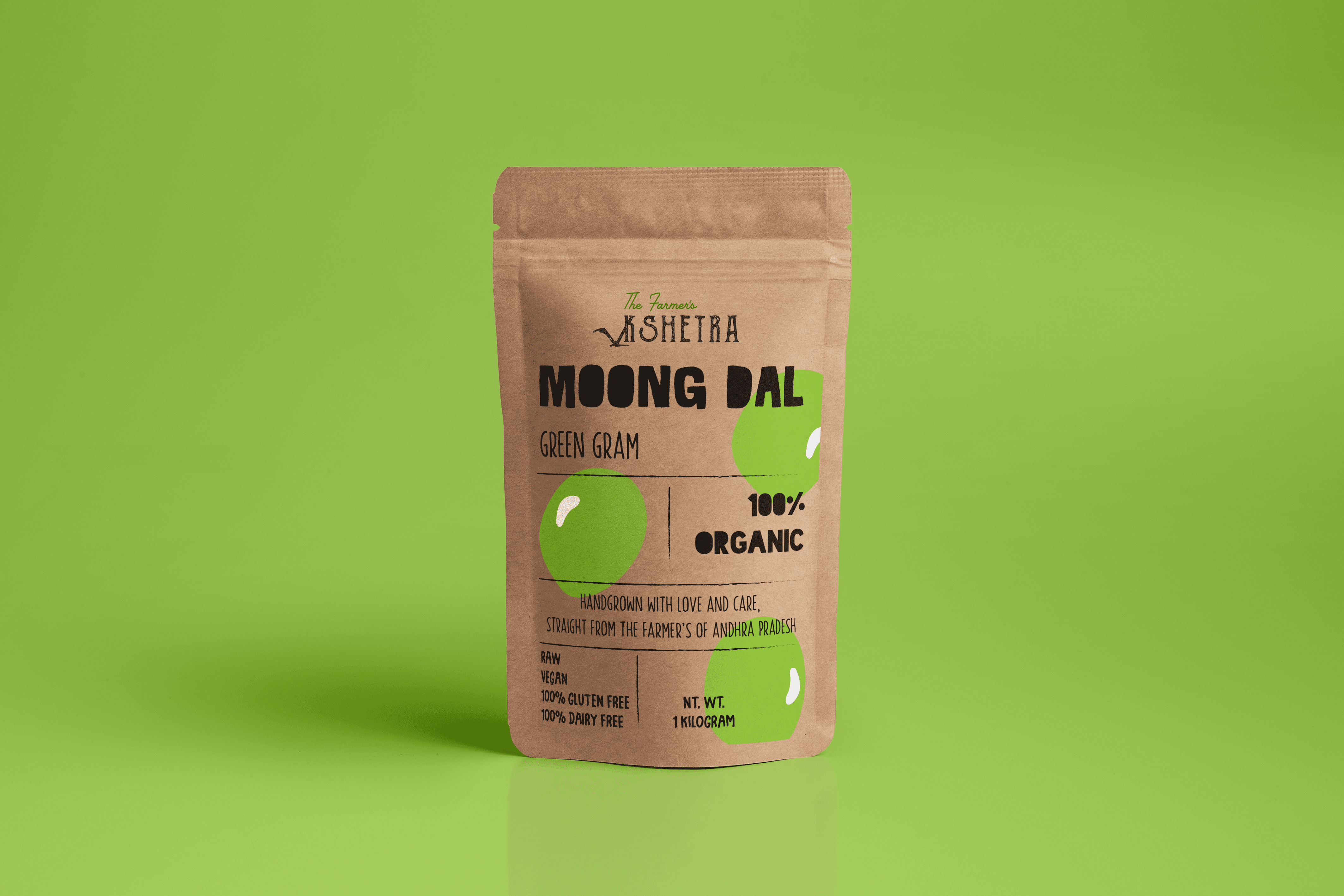
For the packaging, the goal was to be young, vibrant, and purposefully uncomplicated. The products were designed for first-time conscious consumers, busy young professionals, and households seeking transparency in sourcing. A simple brown kraft paper pouch with a ziplock was chosen to keep the lentils fresh and eliminate the need for repackaging, an added convenience for on-the-go lifestyles.
Each pack featured bright, minimal, playful illustrations of the respective lentils (moong, masoor, urad, etc.), stylized in an organic, motion-filled pattern to suggest energy and life. The color palette was deliberately bold and contrast-rich to pop against the natural brown background, helping the products stand out on crowded grocery shelves. The packaging also included sourcing information like where and by whom the lentils were grown, allowing consumers to build a closer connection to the product and the people behind it.
The result was a brand that felt personal, rooted, and global at once. It felt grounded in Indian agriculture, yet styled for the modern, ethical consumer. The identity and packaging work together to tell a story of empowerment, care, and traceable goodness, right from the field to the plate.