SCOPE:
WEBSITE HOMEPAGE DESIGN
CLIENT:
CELERY DESIGN COLLABORATIVE
YEAR:
2023
ROLE:
CONTRACT DESIGNER
The Charlie Cart Project
project context.
see it live
The Charlie Cart Project is a national food education initiative empowering children with the knowledge and confidence to make healthy food choices through hands-on cooking. In collaboration with educators and community organizations across the U.S., the program provides everything needed to get kids cooking; combining tools, curriculum, and training into one accessible platform.
As part of a design contract with Celery Design Collaborative, I was brought on to design the homepage for The Charlie Cart Project’s website, a key gateway to the brand’s mission and offerings. The homepage would later serve as the foundation for the rest of the site’s design, requiring a thoughtful balance of visual storytelling, clarity, and engagement.
design objective.
The client envisioned a homepage that reflected the brand’s core ethos - educational, energetic, and purpose-driven, while also leaning into a mid-century modern aesthetic. The visual direction needed to feel artistic, bold, and human-centered, speaking to both institutional partners and individuals passionate about food education. We were working within an existing brand guideline, using defined typography and color palettes, but there was still ample room to explore expressive, layout-forward design.

design outcome.
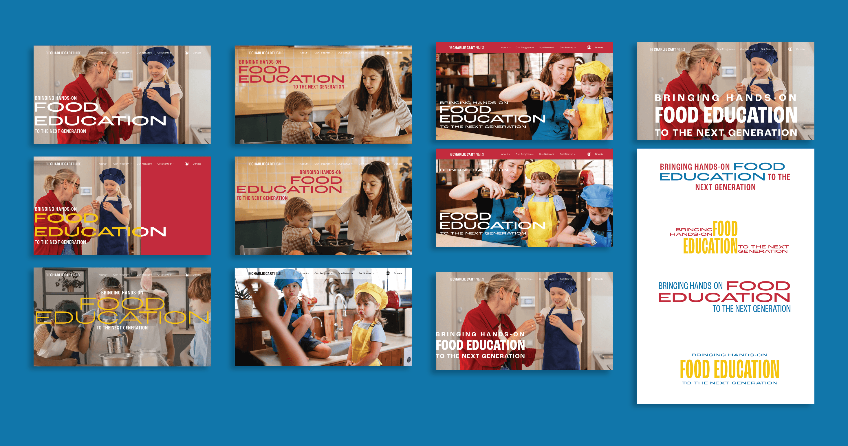
The project began with wireframing and structural mapping to define content hierarchy, UX pathways, and interaction flow. From there, I moved into visual exploration, experimenting with a range of aesthetic treatments that played with bold shapes, layered compositions, and modernist sensibilities. I explored multiple approaches to type, scale, and rhythm, seeking a balance between retro inspiration and contemporary clarity.
Photography played a critical role in shaping the tone of the homepage. I curated and tested various photographic directions, from raw, documentary-style shots to clean, minimal top-down visuals in order to understand the emotional impact each style could lend. This helped identify a visual language that felt both aspirational and authentic, grounding the site in real moments of cooking and learning.
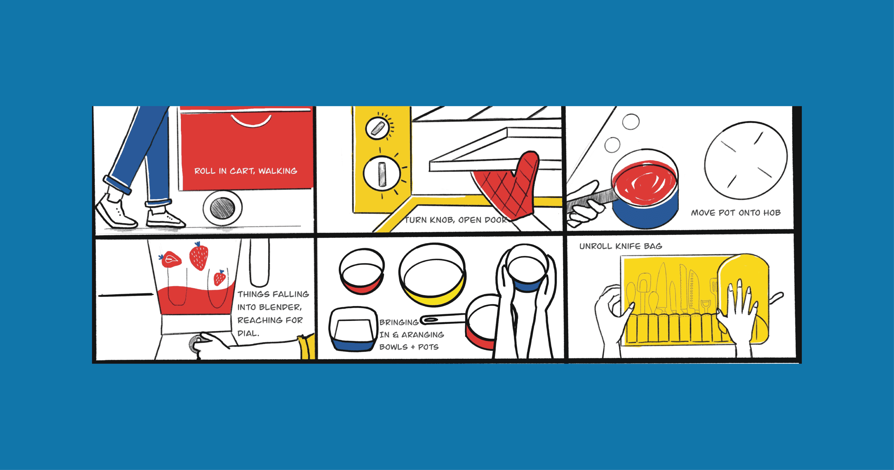
In parallel, I developed a storyboard for a potential homepage video, envisioning a poetic sequence of top-down shots: hands chopping, pouring, stirring with each action seamlessly blending into the next. The concept aimed to evoke a sensory, cinematic feel, reinforcing the tactile, joyful nature of food and learning.
Through this process, the homepage design began to take shape: bold color blocks, modular layouts, and expressive typography came together to create a dynamic yet approachable digital presence. The resulting visual language feels both vintage and fresh, mirroring the brand’s mission to honor timeless values through innovative, hands-on education.