SCOPE:
BRANDING, ILLUSTRATION & PACKAGING DESIGN
CLIENT:
ARANYAKA LIFESTYLES
YEAR:
2018
ROLE:
INDEPENDENT DESIGNER
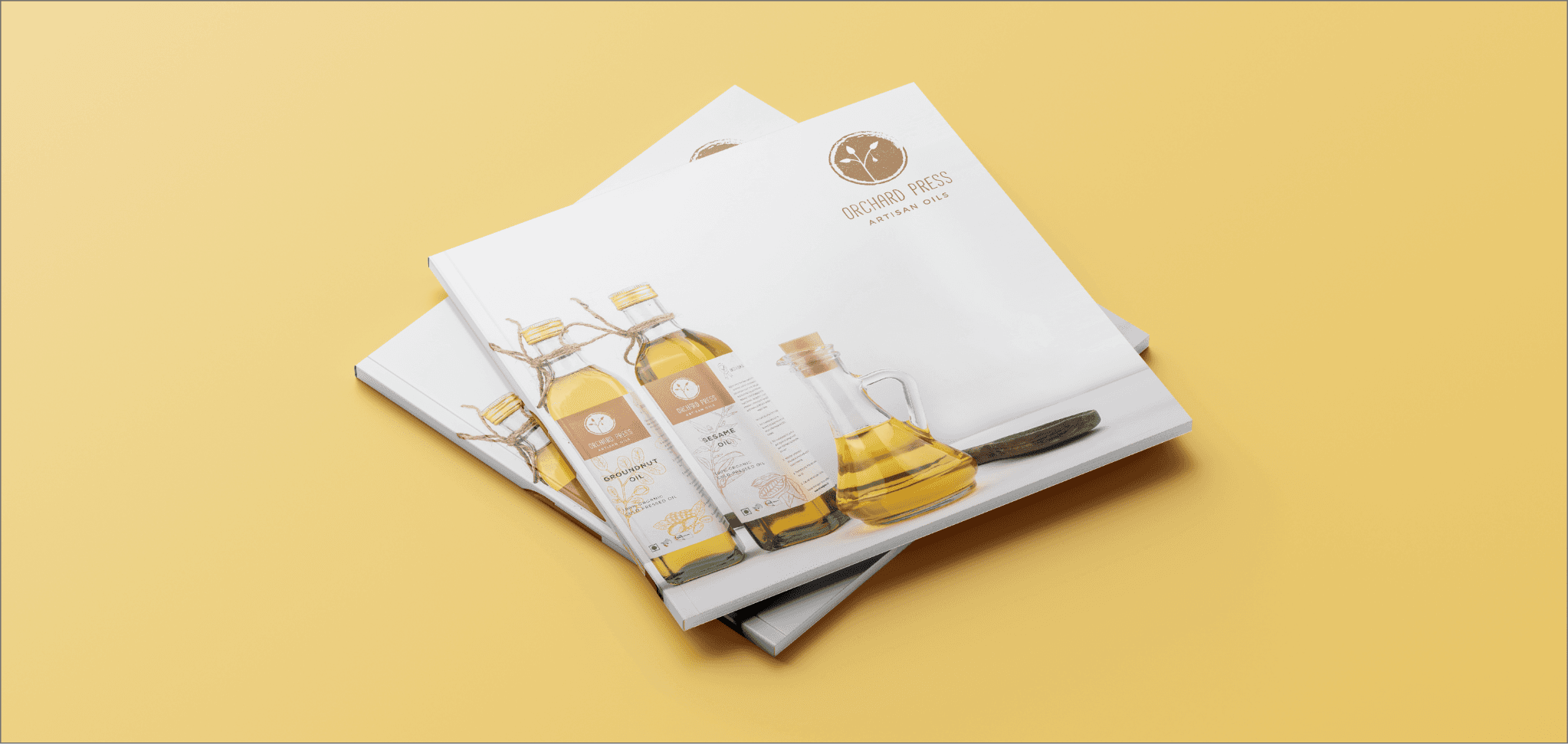
Orchard Press
project context.
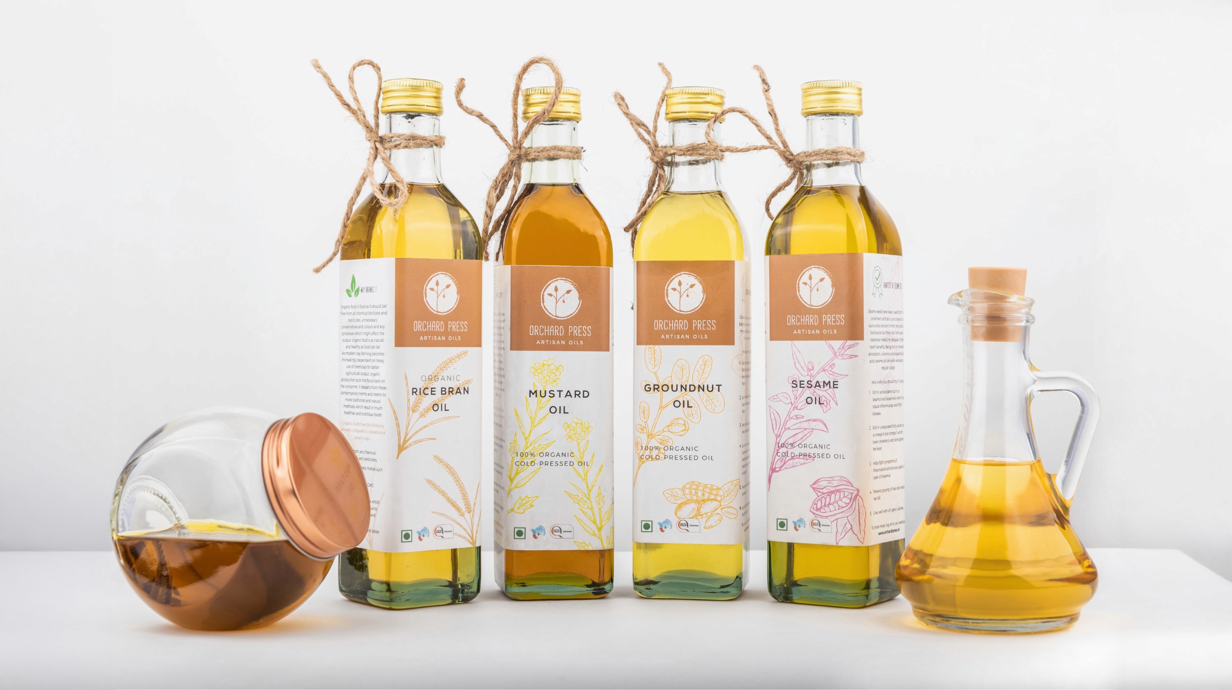
Based in Pune, India, The Orchard Press is a young startup committed to producing organic, cold-pressed oils that are pure, unadulterated, and rooted in nature. With a focus on quality, sustainability, and health, the brand set out to create a product line that would cater to the premium market, balancing traditional processes with refined aesthetics. As they prepared to launch five varieties of oils — Safflower, Flaxseed, Coconut, Groundnut, and Olive — they approached me to design the brand identity and packaging system for their first line of products.

design objective.
The challenge was to build a brand that would communicate both purity and luxury, and natural products that delivered without compromise, wrapped in a visual language that felt elevated, intentional, and rustic in the right places. The identity and packaging needed to emphasize quality and trustworthiness while standing out on the shelves of premium grocery and lifestyle stores.
design outcome.
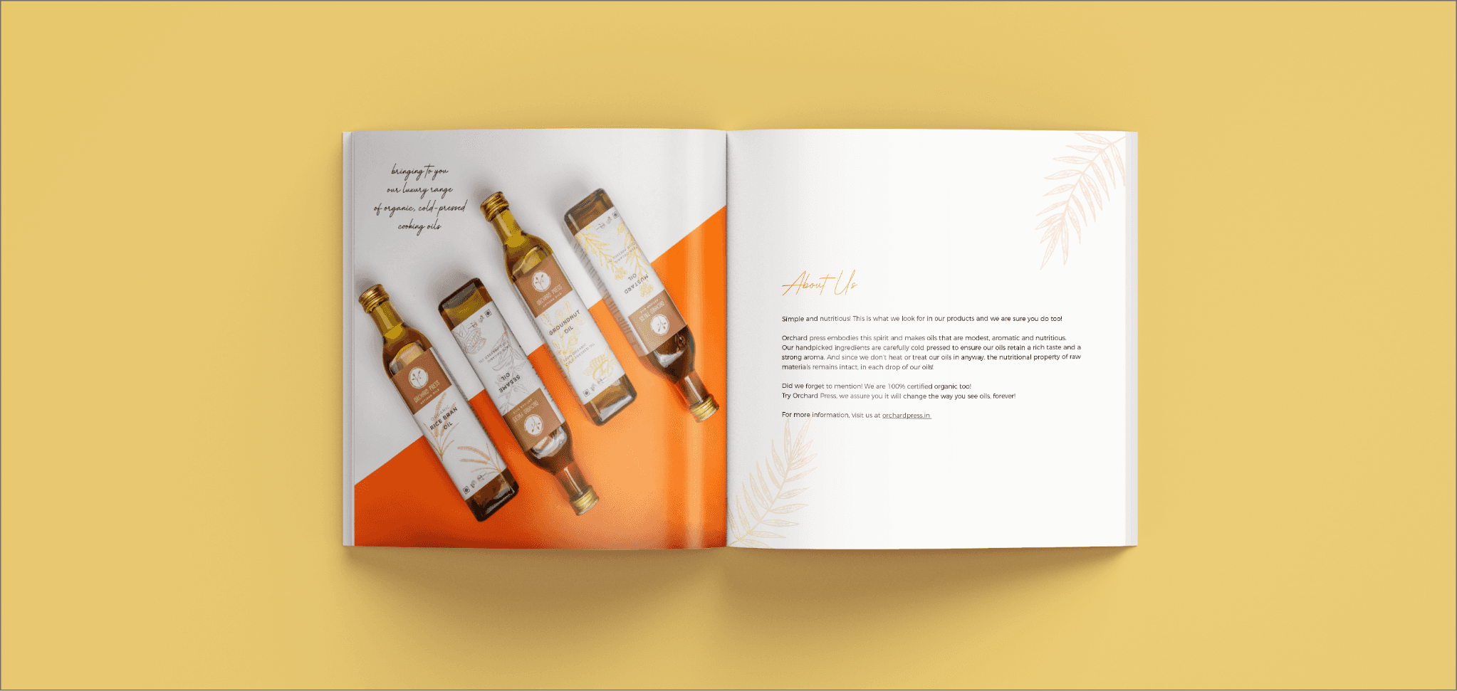
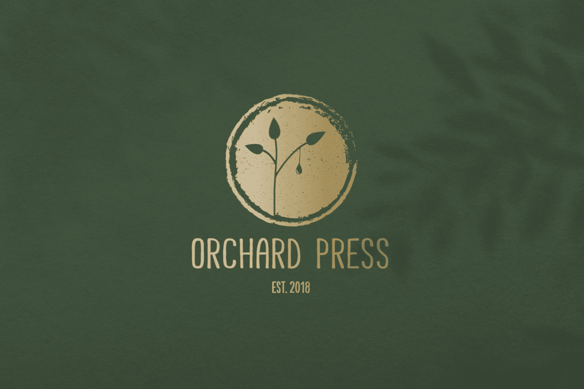
The logo was designed to weave together the three foundational aspects of the brand: premium positioning, cold-pressed purity, and culinary roots. A drop of oil falling gently from a plant branch became the central icon, symbolizing the direct-from-nature ethos of the brand. A textured gold tone lent the mark a feeling of luxury, while subtle rustic detailing grounded it in authenticity.
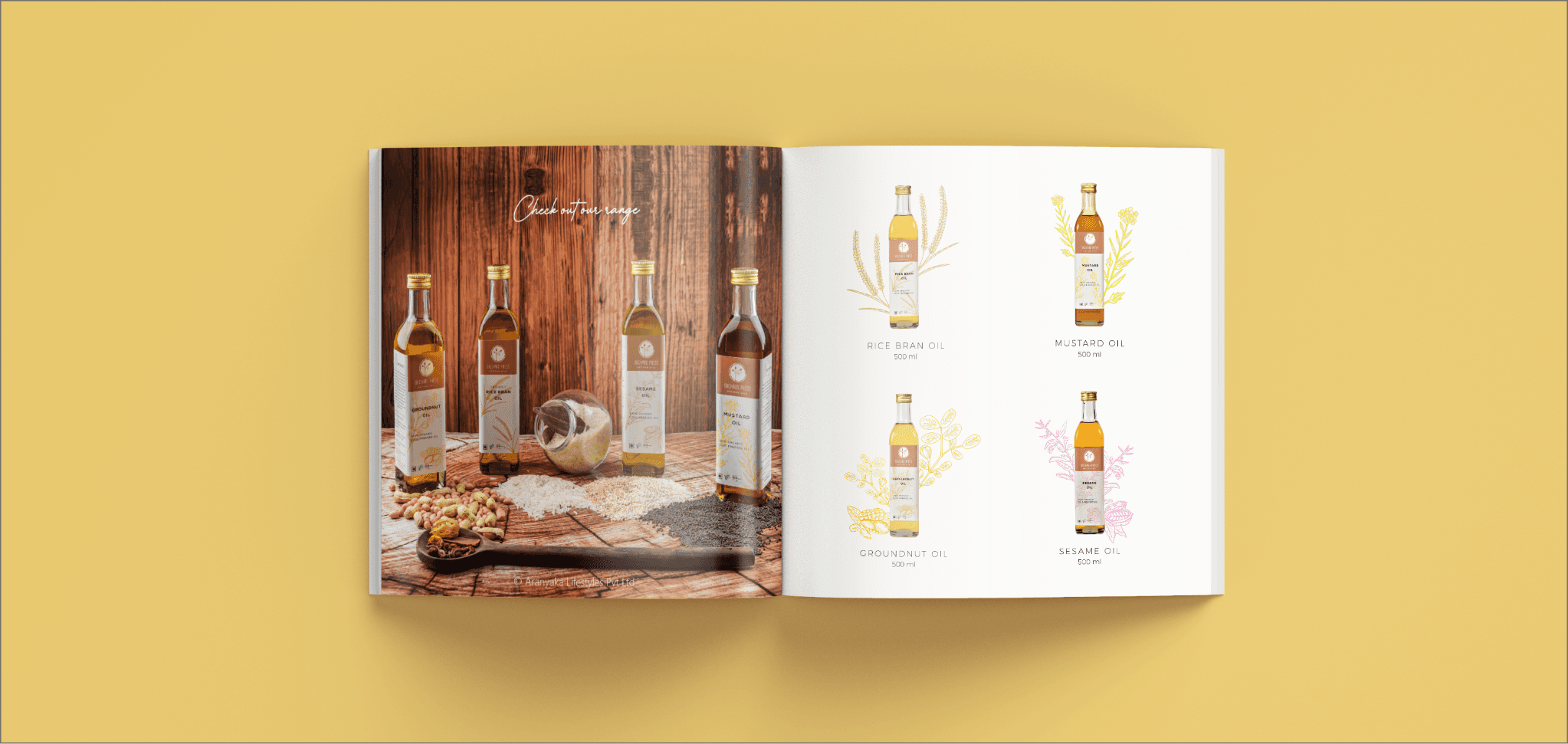
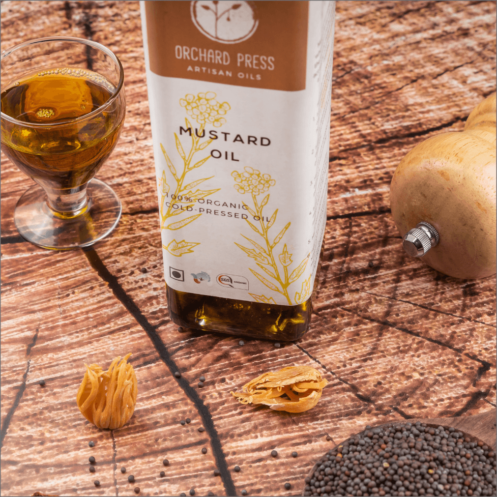
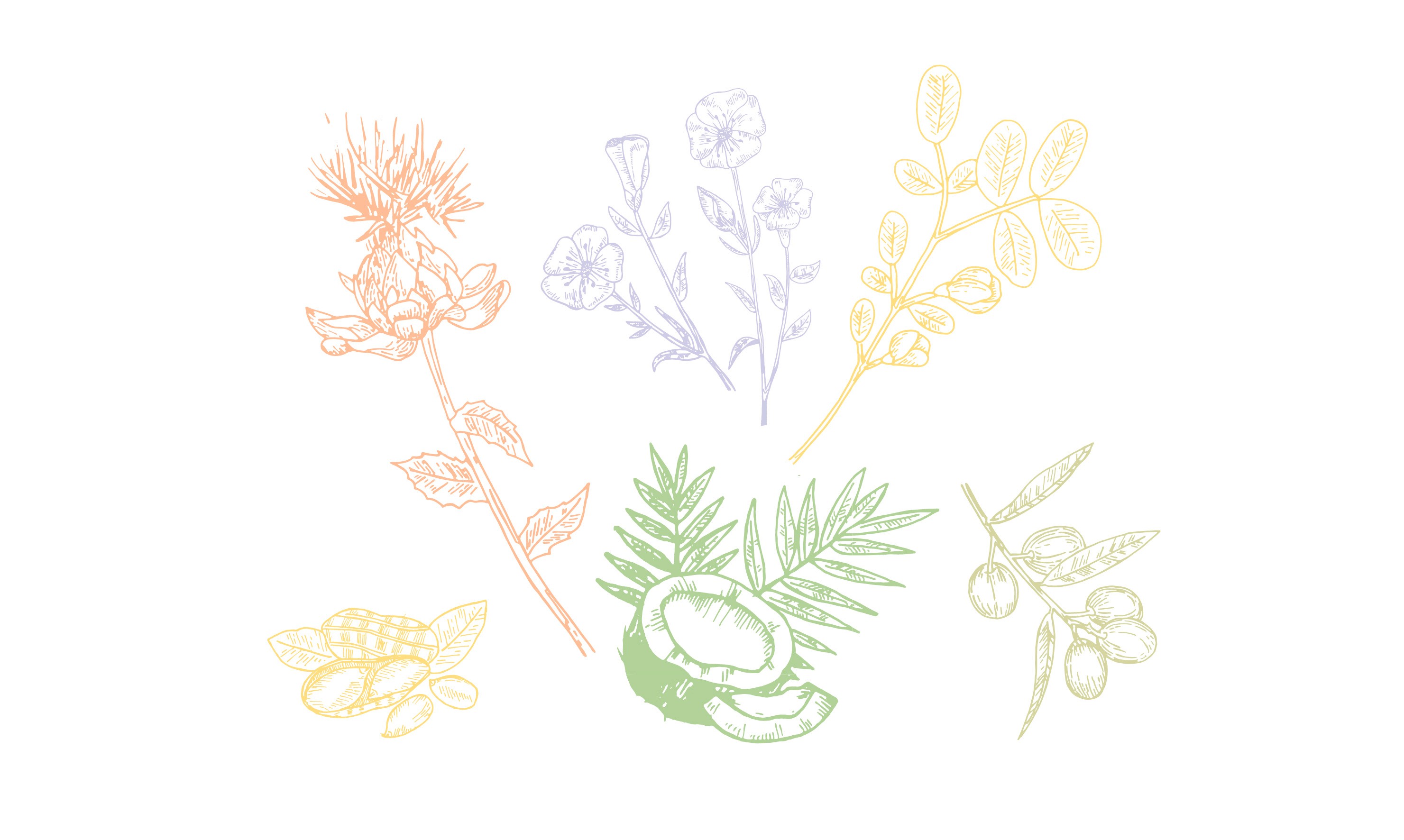
For the packaging, the initial concept featured dark glass bottles paired with vibrant labels, each color carefully selected to reflect the natural hue of the flower from which the oil was derived — orange for safflower, soft green for olive, warm beige for coconut, and so on. These colors not only offered easy visual distinction between oils but also reinforced the plant-based origins of each product. Vintage-style botanical illustrations, hand-drawn and later digitized, added a refined, old-world charm to the labels, conveying heritage, care, and credibility.
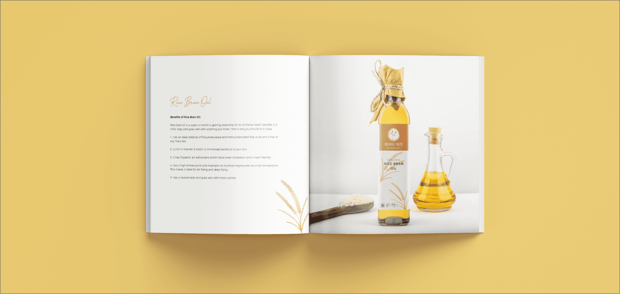
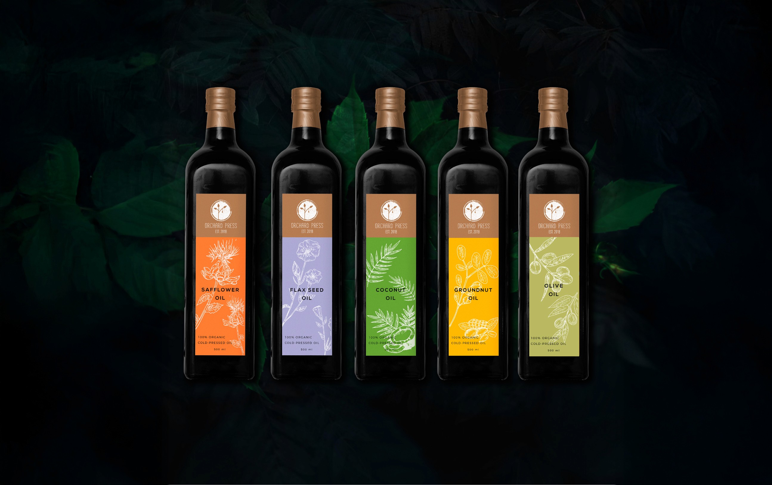
However, due to manufacturing constraints in the first production phase, the brand had to pivot to clear bottles instead of the planned dark ones. This introduced new challenges around label visibility, consistency, and premium appeal. When paired with yellow oils, some of the original colored labels lacked contrast and visual clarity. To address this, the label system was reimagined using a white base with delicate botanical illustrations in the signature colors. This preserved the color coding while ensuring contrast, clarity, and cohesion across the product range, even with the variable tones of the oils themselves.
The result was a packaging system that remained rooted in the brand’s values; clean, premium, and nature-led, while adapting gracefully to real-world constraints. In addition to the packaging design, a product catalogue was also developed to introduce the oils and brand philosophy to retailers and partners, further extending the brand’s visual language across printed collateral.