SCOPE:
BRAND DESIGN
CLIENT:
IEDSPIRE
YEAR:
2023
ROLE:
INDEPENDENT DESIGNER

iEdspire
project context.
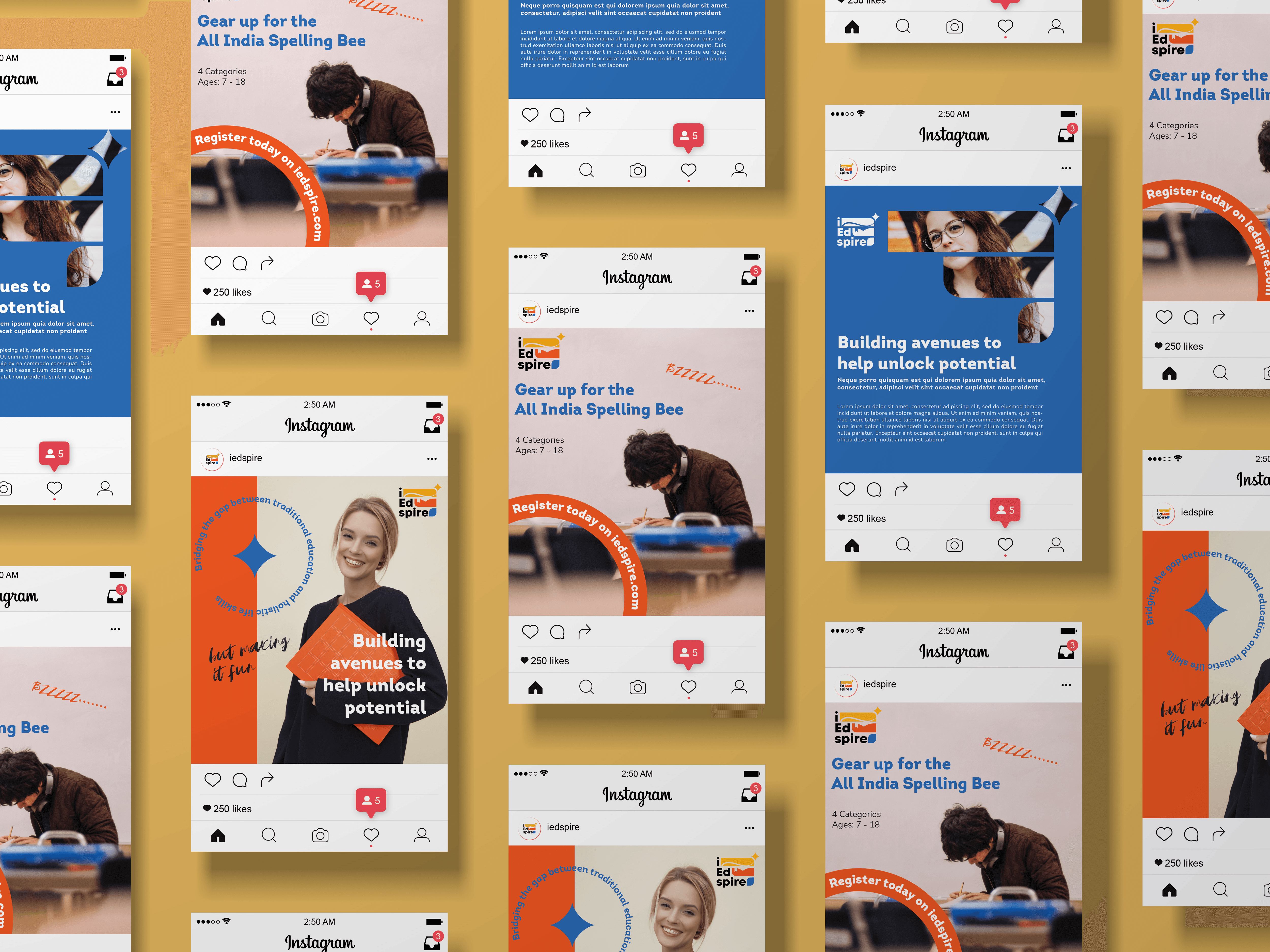
iEdspire is a purpose-driven education startup based in India that seeks to nurture holistic growth in children, beyond the boundaries of traditional academics. Through a diverse mix of activities, from spell bees and mock courts to public speaking and storytelling, it encourages young learners to explore their strengths, discover new passions, and build life skills that shape them into confident, well-rounded individuals.
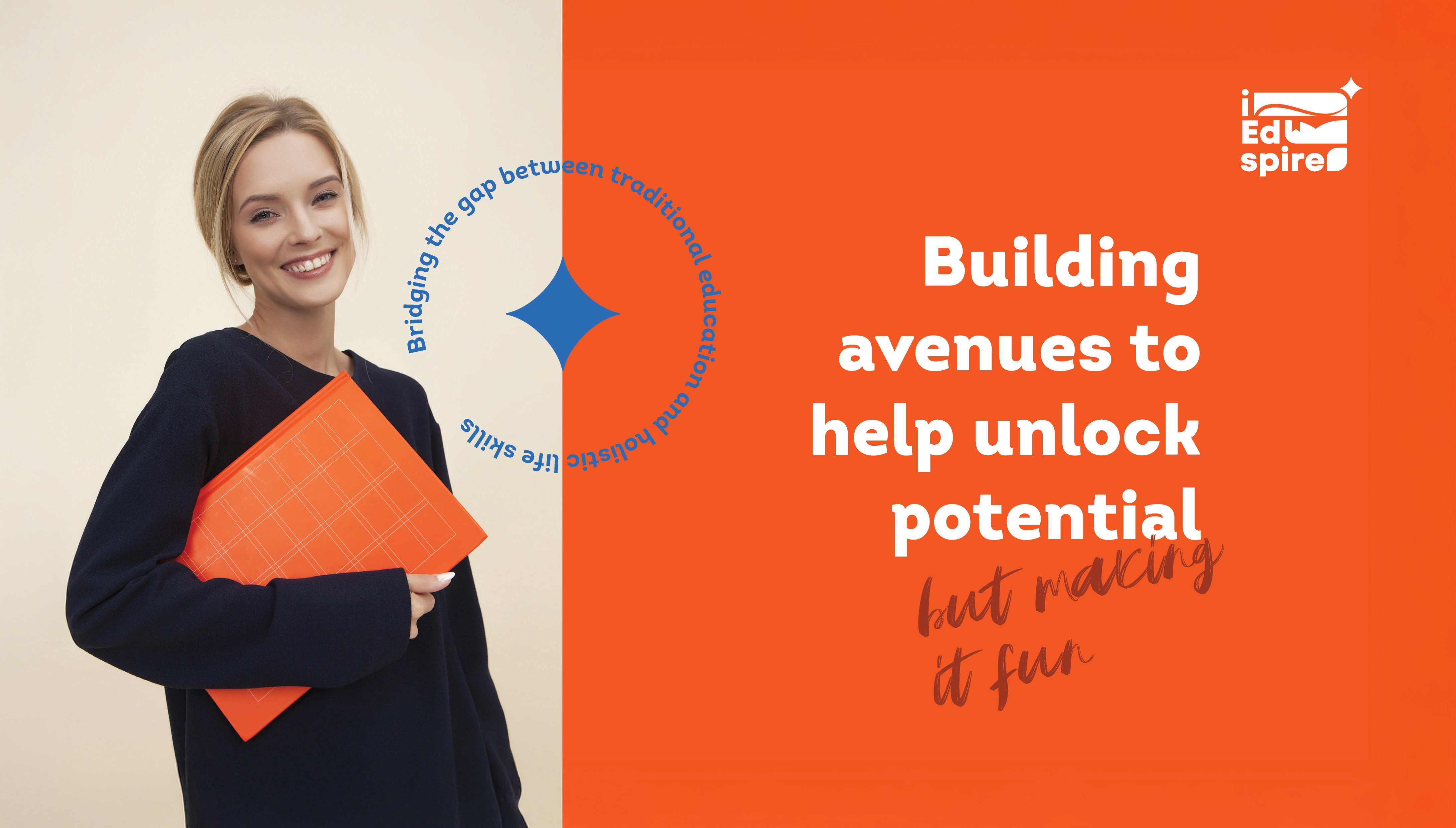
The brand needed an identity that could reflect its core mission of unlocking the magic within every child, while resonating with both children and their parents.

design objective.
The brand and logo had to:
Convey growth, learning, and aspiration in a clear, memorable way
Balance playfulness with trustworthiness to appeal to both children and parents
Reflect the brand’s slogan: “Finding magic in every child”
design outcome.
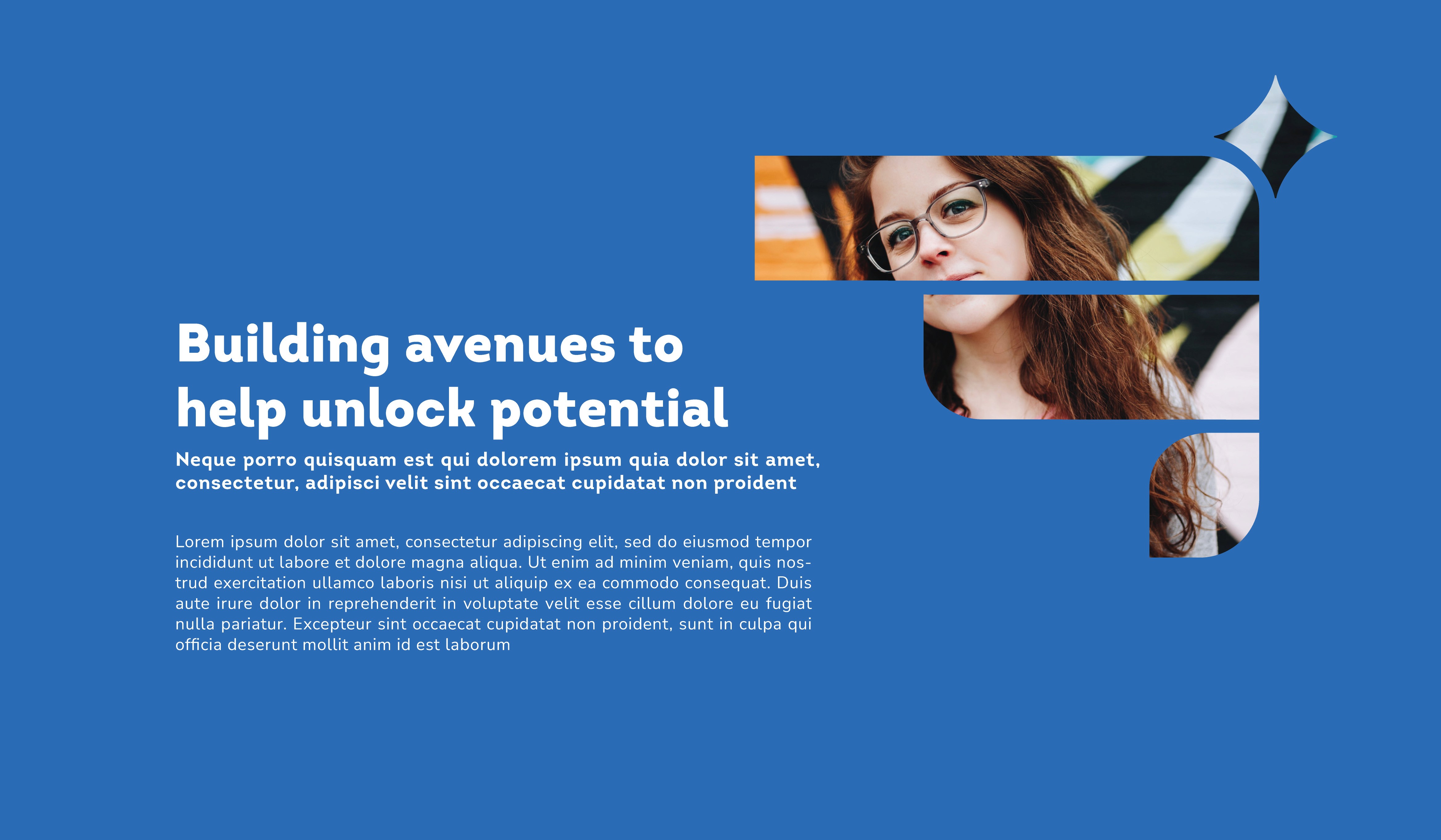
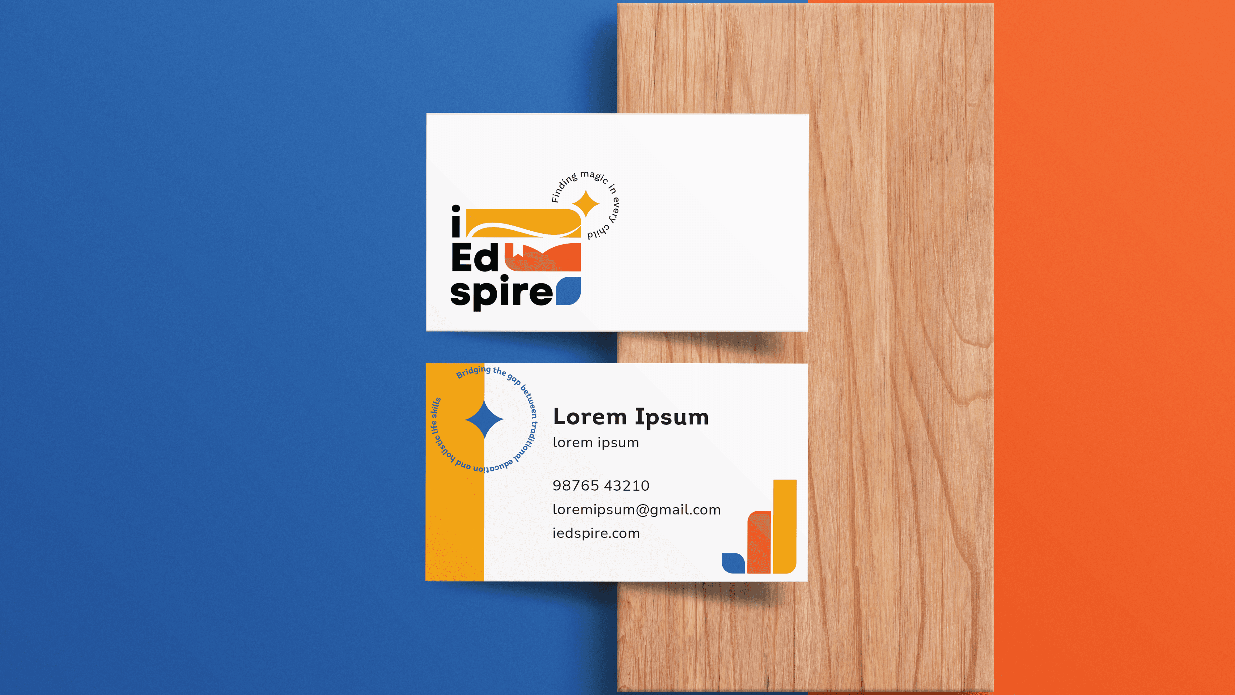
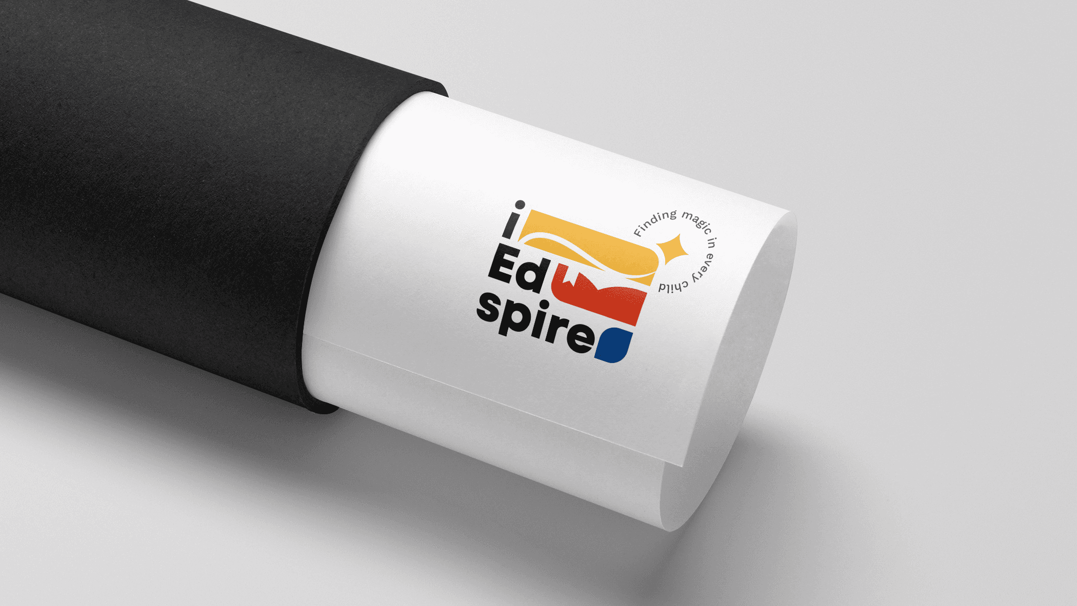
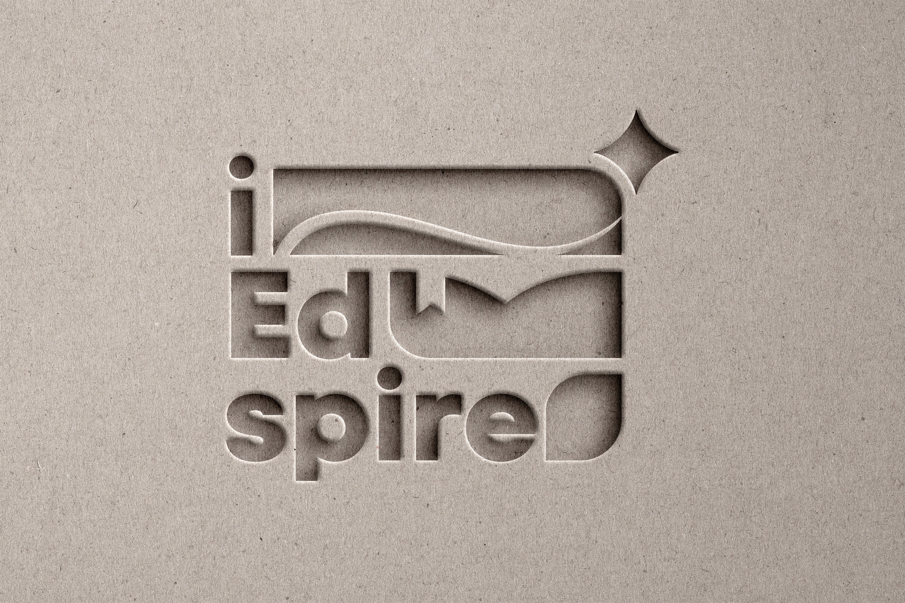
The logo was built around the brand name - iEdspire, a blend of “education” and “aspire.” To guide pronunciation and reinforce meaning, the name was broken into three distinct parts: i • Ed • spire. This breakdown visually hints at its roots in learning and aspiration while adding rhythm and clarity to the identity.
The visual identity is centered around three graphic bars, each symbolizing a key element of the brand’s philosophy:
The yellow bar features a shooting star, symbolizing inspiration, dreams, and stepping beyond your comfort zone. The star is placed just outside the bar, representing how iEdspire pushes children to think beyond limits and reach for more.
The red bar doubles as an open book and a bookmark and a symbol of continuous learning and evolving potential. Like a marked page in a book still being read, each child’s journey is still unfolding, and iEdspire plays a part in helping them grow through it.
The blue bar, along with the other two, forms a subtle set of steps, acting as a metaphor for progress, development, and skill-building.
The color palette is a combination of vibrant red, blue, and yellow and was chosen to evoke a sense of energy, curiosity, and warmth while maintaining a professional tone. The typefaces used are clean yet playful, creating a balance of credibility and approachability.
The slogan “Finding magic in every child” is central to the brand voice. It acknowledges that children already carry potential within them, and iEdspire exists to illuminate, nurture, and celebrate that inner brilliance.
The resulting identity is modular, meaningful, and instantly engaging with a visual system that captures the spirit of possibility, play, and purpose that lies at the heart of iEdspire.